
Restaurant Logo Ideas: 15 Styles, Color Palettes, and Examples
The best restaurant logo ideas begin with the experience you want guests to expect. A refined neighborhood bistro, a bright smoothie counter, and a late-night burger spot may all serve food, but they should not look as if they came from the same menu template.
Your logo has a practical job: it needs to be recognizable on a storefront, legible in a delivery app, clear on a small menu, and distinctive among nearby competitors. Start with the restaurant's personality and service model, then choose a visual direction that supports it.
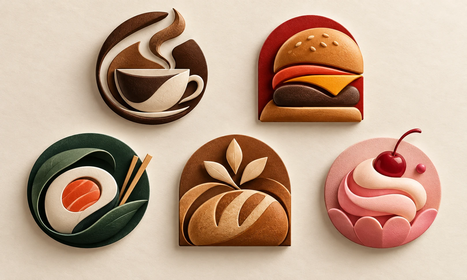
Start With the Dining Experience, Not a Food Icon
A fork, chef hat, plate, or burger can communicate category quickly, but category alone rarely creates a memorable restaurant identity. Begin by describing the customer experience in a few words: quiet and considered, fast and social, hand-crafted, family-friendly, daring, nostalgic, or health-focused.
Then add the operational context. Is the business primarily a sit-down destination, a takeaway counter, a delivery-first brand, a food truck, or a packaged product line? A mark that must work as a 48-pixel app icon needs a stronger silhouette than one used mainly on a large storefront sign.
This short brand brief gives you a useful filter for every restaurant logo idea that follows. If a visual direction looks attractive but does not match the experience, it is decoration rather than identity.
15 Restaurant Logo Ideas by Brand Personality
1. The warm neighborhood café
Use a compact wordmark with a soft, human detail: a subtle steam curve, bean-like oval, or rounded frame. Earthy neutrals and restrained warm accents can feel welcoming without making the identity look old-fashioned.
2. The specialty coffee bar
Choose a crisp monogram, simple geometric mark, or editorial wordmark. This direction suits brands that want to signal craft, sourcing, and a deliberate ritual rather than a generic café atmosphere.
3. The fast-casual burger spot
Build energy with a bold name, high-contrast color pairing, and a shape that can be seen from a distance. A simplified flame, stack, or custom letter can work better than a detailed illustrated burger.
4. The premium sushi restaurant
Use generous spacing, clean geometry, and a limited palette. A simple wave, brush-like curve, or abstract ingredient form can suggest care and precision without relying on a predictable sushi icon.
5. The family Italian restaurant
Consider a friendly wordmark, an emblem inspired by shared-table rituals, or an understated architectural detail. The goal is warmth and familiarity, not an imitation of a regional flag or an overfilled crest.
6. The contemporary ramen bar
Pair a compact symbol with expressive but readable lettering. Steam, bowls, or noodles can be abstracted into one clear gesture; avoid intricate scenes that disappear on a delivery thumbnail.
7. The artisan bakery
Use imperfect curves, a stamped seal, grain-like shapes, or a hand-drawn feeling—provided the final mark stays clean at small sizes. The identity should suggest texture and care without looking homemade by accident.
8. The dessert shop
Let the composition feel light and playful. Rounded shapes, a cheerful accent color, and a distinct wordmark can carry more personality than an overloaded cupcake illustration.
9. The healthy bowl brand
Choose simple, fresh shapes and confident negative space. Greens and natural tones can help, but the strongest idea is often a clear symbol of balance, movement, or a memorable ingredient form.
10. The food truck
Prioritize speed of recognition. A badge or bold illustrated character can work well when it has a clean outline and remains readable from a distance, on a sticker, or on a social profile.
11. The barbecue restaurant
Use weight, warmth, and texture carefully. A sturdy type treatment, ember-inspired color, or simple smoke gesture can suggest slow cooking without resorting to a generic grill clip-art mark.
12. The plant-based restaurant
Move beyond the standard leaf. Consider an abstract growing form, a lively monogram, or a fresh color relationship that communicates optimism rather than a narrow dietary label.
13. The seafood counter
Use controlled curves, a wave-like rhythm, or a strong letterform. Avoid packing fish, shells, nets, and anchors into one image; one distinct visual cue is easier to remember.
14. The fine-dining destination
Let typography and spacing do most of the work. A restrained wordmark, monogram, or quiet emblem can feel more confident than gold effects or elaborate decorative flourishes.
15. The delivery-first virtual kitchen
Design for the screen first. The name must be legible in a compact card, and the symbol should stay clear when surrounded by food photography, discount labels, and app interface elements.
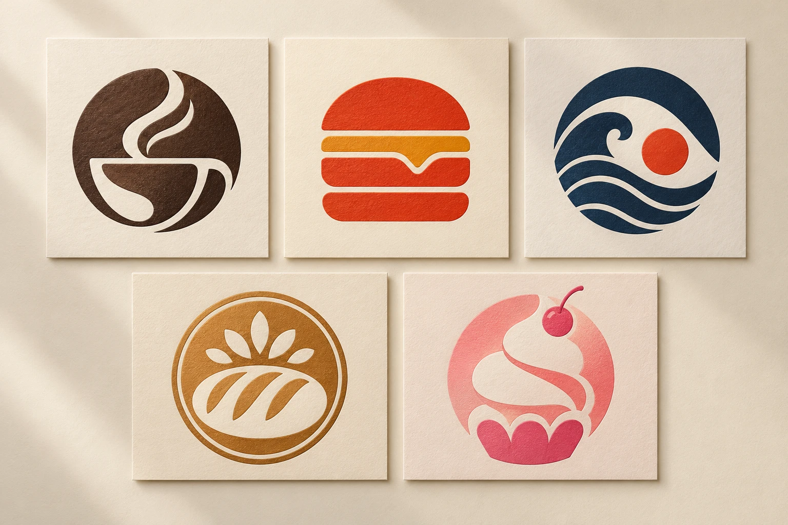
Restaurant Logo Color Ideas and What They Signal
Color can set the temperature of a restaurant brand before a guest reads the menu. Warm reds, oranges, and deep yellows can feel energetic and appetizing when used with restraint. Dark green, cream, and charcoal may suit a natural, premium, or slow-food concept. Blue can feel clean or coastal, but it needs a strong supporting story to avoid becoming generic.
Instead of selecting a palette from a trend board, decide what each color needs to do:
- Primary color: establishes recognition in the most common touchpoints.
- Supporting neutral: gives menus, packaging, and digital layouts room to breathe.
- Accent color: adds energy to a callout, icon, or small brand moment without carrying the entire identity.
Test the logo in one color as well. If the design only works with a gradient or a special background, it may become difficult to reproduce consistently.
Typography Choices for Restaurant Logos
Restaurant typography should match the pace and personality of the place. A compact sans serif can feel direct and modern for a counter-service concept. A high-contrast serif can suggest ceremony for a bistro or fine-dining brand. Hand-drawn lettering can create warmth for an artisan bakery when it remains legible.
Avoid choosing a type style solely because it looks fashionable in a large mockup. Check every letter at the smallest size, especially if the restaurant name is long. Make sure characters are not confused with one another and that the wordmark still reads quickly in a delivery-app listing.
How to Choose a Symbol Without Looking Generic
The strongest restaurant symbols usually come from a specific part of the brand story: a local ritual, a signature ingredient, an unusual serving style, a founding detail, or a memorable mood. That is more useful than beginning with a generic food icon.
For example, a noodle bar could build a simple looping line around the idea of a shared bowl rather than draw a detailed ramen dish. A bakery could use the rhythmic fold of dough rather than a stock wheat bundle. The symbol does not need to explain the entire menu; it needs to be distinct enough to become familiar.
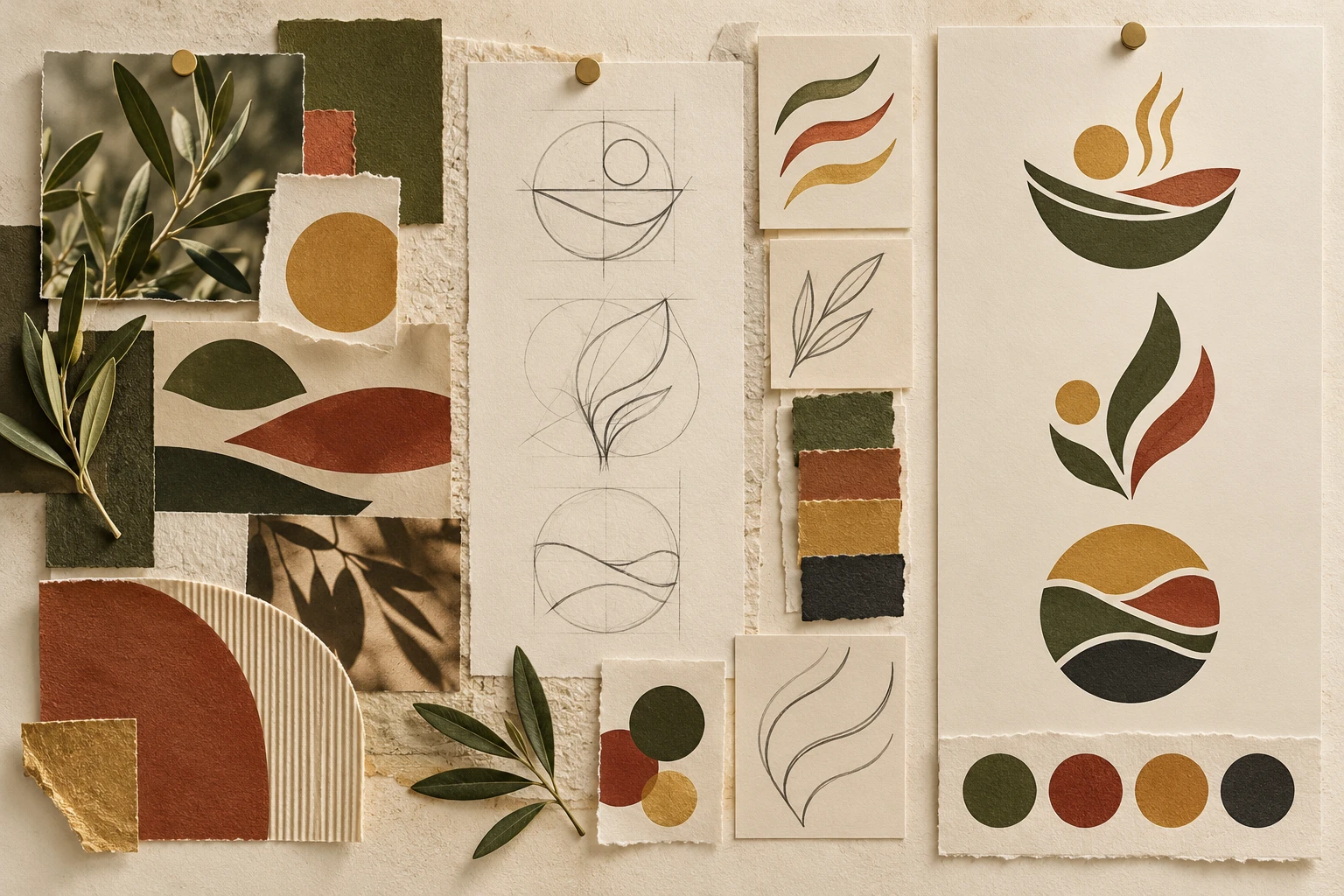
Create a Restaurant Logo Brief Before You Generate Concepts
Write a short brief before exploring restaurant logo ideas with a design tool. Include the restaurant type, audience, price point, desired mood, visual elements to avoid, and the most important place the mark must work.
For example: “A fictional neighborhood breakfast café for remote workers and weekend families. Calm but not quiet, warm natural materials, easy-to-read name, one simple sunrise-inspired shape, avoid vintage diner clichés and overly detailed food illustrations.” This is specific enough to guide a useful concept without forcing a finished answer.
An AI logo maker can help you explore original directions from that brief. Compare concepts by readability, silhouette, category fit, and originality. Treat any generated result as a concept to review rather than proof that it is ready for trademark use.
Create a Restaurant Logo From Your Brand Brief
Common Restaurant Logo Design Mistakes
One common mistake is trying to show every dish, ingredient, and story element at once. The result becomes difficult to identify at a glance. Another is using a color palette or illustration style that looks appropriate for a different restaurant category. A fine-dining mark that resembles a children's dessert brand sends mixed signals before guests see the menu.
Also avoid treating a logo as the complete visual identity. Your packaging, menus, photography, interior, and social content need to reinforce the same personality. Start with a clear mark, then build the surrounding system deliberately.
The logo mark guide explains how different logo types behave, while abstract logo design can help when a direct food illustration would make the concept feel too familiar.
Frequently Asked Questions About Restaurant Logos
What makes a good restaurant logo?
A good restaurant logo is easy to recognize, fits the dining experience, and works at the small sizes customers see on menus and delivery platforms. It does not need to show a literal dish to communicate the category.
Which colors work best for a restaurant logo?
There is no universal restaurant palette. Choose colors that support the intended mood, remain readable in real use, and distinguish the restaurant from nearby competitors. Always test the mark in one color too.
Should a restaurant logo include food?
Only if a food element is genuinely distinctive to the brand and can be simplified into a clear symbol. A well-chosen wordmark or abstract shape can be more memorable than a generic fork, plate, or food illustration.
How do I make a restaurant logo stand out on delivery apps?
Prioritize a bold silhouette, legible name, and restrained detail. Preview the logo at small sizes next to food photography and interface labels before finalizing it.
Can I use AI to explore restaurant logo ideas?
Yes. Use a concise brand brief to explore directions, then review the results for clarity, originality, and practical use. Do not treat a generated image as a guarantee of trademark availability or final production readiness.
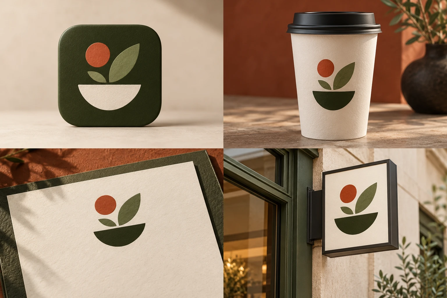
The most useful restaurant logo ideas are not copied from a category template. They turn a clear dining experience into one recognizable visual signal. Define the experience first, simplify the idea, and test the result where hungry customers will actually encounter it.