
How to Make a 3D Logo: Styles, Prompts, and Tips
Learning how to make a 3D logo does not have to begin with professional modeling software. For many websites, social campaigns, presentations, and brand concepts, what you need is a polished 2D image that creates a convincing sense of depth through lighting, shape, texture, and perspective.
You can start with a logo you already use or describe a completely new idea. The important part is knowing what should remain recognizable, which visual treatment fits the brand, and what to check before you publish the result. This guide walks through that process without confusing a 3D-style image with an editable 3D model.
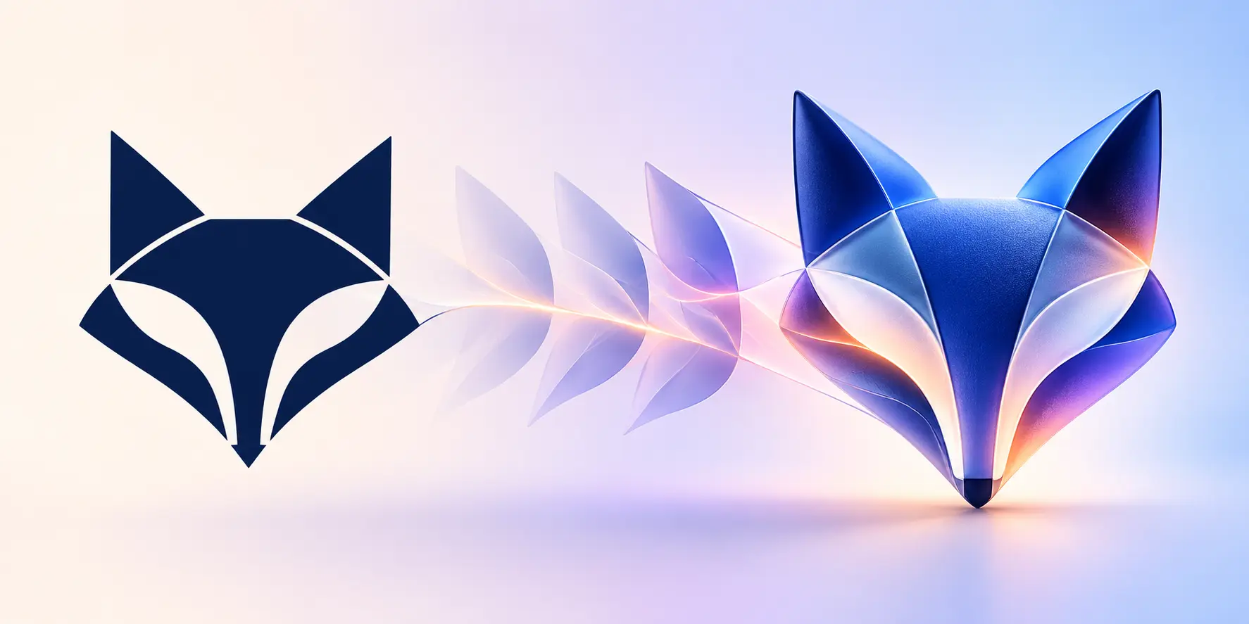
What Is a 3D-Style Logo?
A 3D-style logo is a two-dimensional logo image designed to look dimensional. It may use rounded surfaces, simulated extrusion, material texture, highlights, shadows, reflections, or controlled perspective to suggest physical form. The effect can be subtle, such as a soft edge and contact shadow, or expressive, such as frosted glass, molded material, or polished metal.
The strongest 3D-style logos still work as logos. Their silhouette stays recognizable, and the material supports the brand rather than hiding it.
3D-style image vs. editable 3D model
A generated 3D-style logo image is not the same as a model built in Blender, Cinema 4D, or another 3D application. It does not give you a mesh, camera, material controls, a rotatable object, or export files such as OBJ, GLB, or STL. It is a finished visual image with a three-dimensional appearance.
That distinction matters when planning the next step. A 3D-style image is useful for digital branding, concept exploration, and campaign visuals. If you need animation from multiple camera angles, a printable physical object, or exact control over geometry, you will need a separate 3D production workflow.
Choose the Right Starting Point
Before thinking about materials or reflections, decide what information the result should follow. There are two practical ways to start.
Refresh an existing logo
Upload an existing logo when recognition matters. A clean source image gives the generator a visual reference for the symbol, layout, colors, and any existing wordmark. Your prompt can then focus on the intended change: for example, keeping a blue fox silhouette while introducing translucent glass, soft depth, or a metallic finish.
Use a clear PNG, JPG, JPEG, or WebP with enough contrast to separate the mark from its background. Remove unnecessary mockup scenery before uploading. If the only file you have includes a white box or unwanted background, prepare a cleaner source with this transparent logo guide.
An uploaded image is a reference, not a pixel-perfect lock. Always compare the output with the original for spelling, proportions, spacing, colors, and recognizable brand details.
Create a new logo from a written idea
Start with a description when you do not yet have a logo. Explain the subject, brand category, personality, color direction, and whether you want a symbol, a wordmark, or both. “A logo for a technology company” is too broad; “an angular fox symbol for a security startup, navy and electric blue, with a clear geometric silhouette” gives the system a useful creative boundary.
In LogoCreator, these starting points do not require a visible mode switch. A successfully uploaded image becomes the visual reference. Without one, the written description supplies the subject. That keeps the decision simple: upload what must be recognized, or describe what needs to be invented.
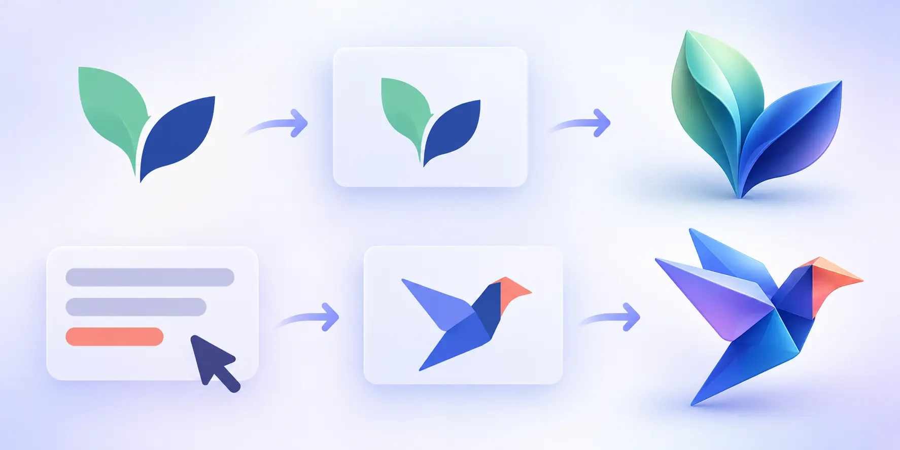
How to Make a 3D Logo Step by Step
Prepare the logo or creative brief
For an existing mark, begin with the cleanest version available. Check that the symbol is centered, the edges are sharp, and the background does not compete with the logo. For a new concept, write down the brand name, audience, industry, symbol idea, mood, and essential colors before opening the tool.
Choose a visual direction
Pick a treatment that supports the brand personality. Transparent surfaces can feel light and digital. Rounded volumetric forms often feel approachable. Molded or tactile surfaces can suggest durability and craft. Character-led treatments suit playful brands, while reflective metals can feel premium or dramatic.
Do not choose a style only because it looks impressive at full size. Consider where the logo will appear and whether its important shapes will still read on a mobile screen, social avatar, presentation cover, or product mockup.
Write a focused prompt
A useful prompt describes the subject first and the finish second. Include only the constraints that materially affect the result. When you upload a logo, say what should remain recognizable. When you start from text, define the symbol and composition clearly enough that the generator does not need to invent the entire brief.
Generate and compare the results
Compare silhouette, legibility, brand fit, color balance, and material consistency. If one direction is close, revise one variable at a time. Changing everything in a single retry makes it difficult to understand what improved the result.
Inspect before downloading
Zoom in and check wordmarks, narrow gaps, highlights, edges, and small decorative elements. Then zoom out. A logo that looks polished at full resolution may lose its identity at favicon or profile-image size.
Choose the available output that fits the next step. JPEG Standard is convenient for quick sharing, PNG Transparent is useful when the logo must sit over different backgrounds, and SVG Vector is intended for scalable vector output. Inspect the downloaded file itself before using it in production; a generated result is not a layered design document.
How to Choose a 3D Logo Style
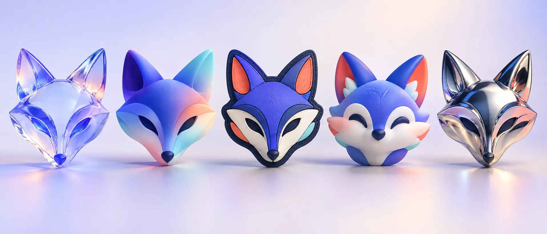
The right finish should reinforce the brand rather than act as decoration. LogoCreator currently presents several distinct visual directions, including Glassmorphism, Gradient Volumetric, PVC Patch, 3D Mascot, and Metallic. Treat them as starting points for exploration, not rigid categories every brand must use.
Light and transparent finishes
Glassmorphism uses translucent surfaces, refraction, soft highlights, and layered depth. It can suit technology, beauty, digital services, or brands that want a light and contemporary presence. Keep the internal structure simple: too many overlapping transparent surfaces can weaken the silhouette.
Soft volumetric depth
Gradient Volumetric treatments use rounded form, broad color transitions, diffuse light, and gentle shadow. They often feel modern and friendly without becoming cartoon-like. This direction works well when a flat mark already has broad shapes that can be given curvature.
Tactile and character-led looks
PVC Patch turns the mark into a molded, layered object with raised areas and edge detail. It can support outdoor, community, apparel, or badge-inspired concepts. A 3D Mascot treatment is more expressive and works best when personality is part of the brand. Check that the character remains a usable emblem rather than becoming a standalone illustration.
Reflective metallic finishes
Metallic treatments use polished reflections and controlled studio lighting to create a sharper, premium impression. They can work for automotive, gaming, fashion, entertainment, or launch visuals. Avoid reflections that break the mark into unrelated fragments or create contrast that disappears on a different background.
How to Write a Better 3D Logo Prompt
A simple prompt formula is:
Subject + brand context + color direction + material or finish + composition + text requirement + preservation constraints
For an uploaded logo, try:
Transform the uploaded fox logo into a frosted glass treatment. Keep the original silhouette, centered layout, navy brand color, and existing wordmark recognizable. Add translucent depth, soft blue-violet refraction, clean edges, and restrained studio lighting. Do not add new symbols or background objects.
For a new idea, try:
Create a dimensional fox symbol for a cybersecurity brand. Use a geometric forward-facing silhouette, navy and electric blue, a polished metallic finish, balanced negative space, and a compact composition suitable for a website header and social profile. Include no extra objects.
If a specific brand name must appear, state it clearly and keep the requested text short. Generated lettering can still contain spelling or spacing errors, so verify every character before treating the result as approved brand artwork.
What to Check Before You Use the Result
Wordmark spelling and readability
Read every letter rather than assuming the text matches the prompt. Check kerning, repeated characters, and the relationship between the wordmark and symbol. If the image is strong but the lettering is unreliable, use the generated symbol as a concept and rebuild the wordmark with approved typography.
Shape and color consistency
Compare an uploaded logo and its result side by side. Look for missing negative spaces, altered proportions, extra contours, or color shifts. Decide which differences are acceptable for a campaign variation and which would damage recognition.
Contrast and small-size performance
Test the mark on light and dark backgrounds and reduce it to the size of a social avatar. Highlights and shadows that create beautiful depth at full size can merge into noise when reduced. The silhouette should remain identifiable even when fine material details disappear.
Intended use
Ask whether the image is a temporary campaign visual, a concept for stakeholder review, or a long-term master logo. A generated 3D-style image can be a strong direction-setting asset, but permanent identity files may still require deliberate vector cleanup, typography work, and brand-system documentation. If you need a scalable conversion workflow, review the Vector Logo Converter separately.
Where Can You Use a 3D-Style Logo?
Dimensional logo images work best where visual impact matters. Website heroes can show the material clearly, social cards can use depth as a launch motif, and presentations or mockups can help stakeholders judge a proposed direction.
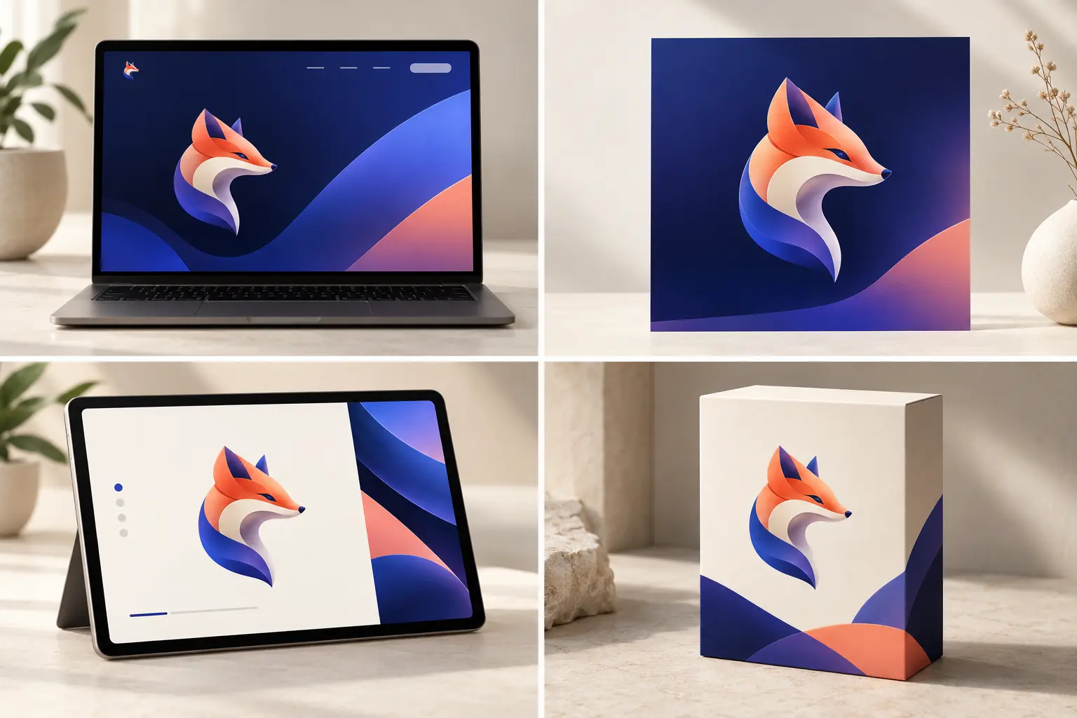
Use these placements as tests, not just decoration. Put the result in a realistic layout and ask whether it still feels like the same brand. Our logo mockup guide explains how context can expose scale, contrast, and placement problems that are easy to miss on a blank canvas.
Motion can be a separate next step after the static mark is approved. If the logo needs to appear in a launch video or social intro, explore these logo animation ideas instead of expecting the 3D image itself to behave like a rotatable model.
Common 3D Logo Design Mistakes
Adding too many effects
Glass, chrome, glow, bevels, shadows, gradients, and particles do not need to appear together. Select one dominant material idea and let the original shape carry the design.
Losing the recognizable silhouette
When transforming an existing logo, material changes should not erase the main contour or negative space. If the result looks like a different symbol, simplify the prompt and restate what must be preserved.
Designing only at full size
Fine seams, tiny highlights, and detailed facial features may disappear on mobile. Review the image at the smallest likely placement before choosing a direction.
Treating the first result as finished artwork
Generation is an exploration process. Compare alternatives, verify text, review legal and brand requirements, and obtain any necessary professional cleanup before adopting a new master logo.
Frequently Asked Questions About 3D Logos
What is a 3D-style logo?
It is a 2D image that uses lighting, texture, shape, shadow, or perspective to look three-dimensional. It is not automatically an editable 3D model.
How can I turn an existing logo into a 3D-style logo?
Upload a clean image of the logo, choose a visual direction, and describe what should remain recognizable. Compare the output with the source before approving changes to the silhouette, wordmark, or colors.
Can I make a 3D logo without an existing design?
Yes. Describe the brand, symbol, colors, personality, and preferred finish. A specific creative brief gives the generator a clearer starting point than a short request such as “make a modern logo.”
Does a 3D logo maker create OBJ, GLB, or STL files?
LogoCreator creates downloadable 3D-style logo images. It does not create a rotatable model, mesh, camera setup, or professional 3D-model file.
Which 3D logo style should I choose?
Choose based on brand personality and placement. Transparent or soft volumetric styles can feel light and digital, tactile treatments can feel crafted, mascot styles emphasize personality, and metallic finishes create a sharper dramatic look.
Will the result preserve my original text and colors exactly?
The tool can use an uploaded logo as a reference and aim to retain recognizable elements, but generated shapes, lettering, spacing, and color can vary. Inspect the result carefully and do not treat it as an exact reproduction without verification.
Create Your Own 3D-Style Logo
Now that you know how to make a 3D logo, begin with the clearest input you have: a clean existing mark or a focused written brief. Choose a visual direction that fits the brand, refine one variable at a time, and review the result in a real use case before committing to it.