
How to Redesign a Logo Without Losing Brand Recognition
Knowing how to redesign a logo is not about making an existing mark look fashionable for a week. It is about deciding what your audience already recognizes, what no longer reflects the business, and how to update the system without erasing its useful history.
A successful redesign gives customers a familiar signal with a clearer, more relevant expression. That may mean simplifying a crowded badge, improving lettering at small sizes, or replacing details that no longer fit your offer. It does not mean changing every visible element simply because the logo is old.
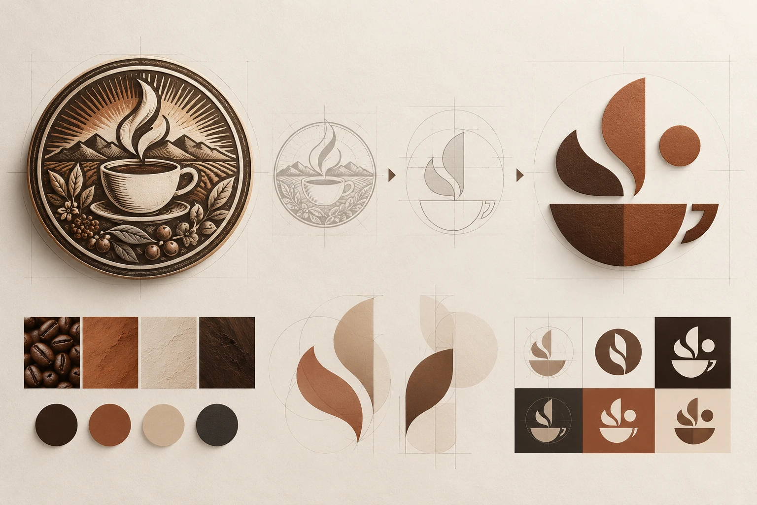
When Does a Logo Need a Redesign?
A logo redesign is worth considering when the current mark creates a practical problem. It may be difficult to read on a phone, rely on visual clichés that no longer fit the business, or represent an offer that has changed substantially. A restaurant that has expanded from a single neighborhood counter to packaged retail products, for example, may need a system that works on labels, delivery apps, signage, and social media.
Start with evidence instead of taste alone. Collect customer comments, screenshots of where the logo is used, and examples of sizes where it fails. Then ask three questions:
- Can people still recognize the name or symbol quickly?
- Does the visual direction match the audience and offer today?
- Does the logo work across the places where customers actually encounter it?
If the answer is mostly yes, a small refresh may be enough. If the mark communicates the wrong category, excludes a new audience, or cannot support the business model, a broader redesign may be justified.
Logo Refresh vs. Full Redesign: Choose the Right Scope
A logo refresh keeps the core recognition assets while improving execution. You might refine spacing, redraw an uneven symbol, simplify colors, or modernize a type treatment. The goal is continuity: returning customers should feel that the brand is still itself.
A full redesign changes the main identity structure. It may introduce a new logo type, new symbol, name treatment, palette, or visual personality. This is appropriate when the company has merged, changed its mission, entered a new market, or needs to leave a genuinely unsuitable identity behind.
Do not choose the larger project just because it sounds more ambitious. The more familiar elements you replace at once, the more carefully you need to explain the change across your website, social profiles, packaging, and customer communication.
Audit What Your Current Logo Already Owns
Before redesigning an existing logo, list the elements people may already associate with you. These can include a distinctive silhouette, a recognizable color relationship, a phrase, a symbol, or even the way the name is arranged. Your audit should separate assets with recognition value from details that are merely decorative.
For each element, label it as one of the following:
- Keep: it is distinctive, readable, and still fits the brand.
- Refine: the idea is useful, but the execution is too detailed, dated, or inconsistent.
- Replace: it creates confusion, looks generic, or represents a business you no longer are.
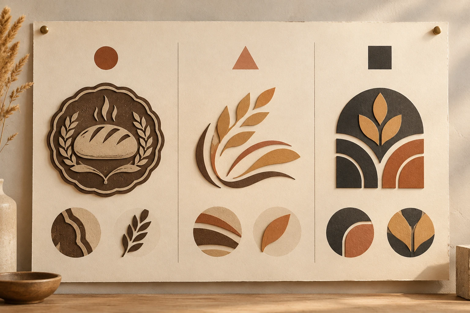
This prevents a common mistake: treating every old detail as sacred. A founder may feel attached to a tiny illustration that customers never notice, while customers may strongly recognize a color or compact monogram the founder barely considered. Use real touchpoints and outside feedback to distinguish the two.
Build a Clear Logo Redesign Brief
Good redesign work begins with a short brief, not a pile of inspiration screenshots. Write the brief in plain language so every concept can be judged against the same decisions.
Include the following:
- Business change: What is different now? A new audience, product category, price point, geography, or brand promise?
- Audience impression: What should people feel in the first few seconds: calm, energetic, premium, playful, dependable, handmade, or technical?
- Recognition assets: Which name, color, shape, or story should remain visible?
- Real-world placements: Where must the logo work first? List small app icons, menus, website headers, labels, uniforms, storefronts, or presentations.
- Avoid list: Note clichés, competitors' visual territory, or details that cannot be reproduced clearly.
This brief also improves concept exploration. If you use an image-led workflow, provide a clean version of the existing mark as a reference and describe the direction you want to test. Keep the prompt focused on the desired change, such as simplifying a badge into a bold single-color emblem, rather than asking for every possible improvement at once.
Explore a New Direction From Your Existing Logo
Explore New Directions Without Copying Your Old Mark
Treat early concepts as hypotheses. Create a small set of genuinely different directions rather than near-identical versions with tiny color changes. One direction could preserve a symbol and simplify it; another could put the name first; a third could use a more abstract interpretation of the original idea.
At this stage, avoid copying a competitor's familiar device, type treatment, or symbol. A redesign should make your brand easier to identify, not easier to mistake for somebody else. If an idea depends on a well-known competitor reference to make sense, it is not yet strong enough.
The professional logo creation guide can help you turn the brief into a focused direction. If your starting point is a drawing, product photo, or existing visual reference, the picture-to-logo workflow is a useful companion—but it should guide exploration, not promise a one-click preservation of every asset.
Compare Concepts in Real-World Contexts
Never approve a redesigned logo from a large, isolated artboard alone. Place the leading options in the contexts where they will live. A concept can look polished at poster size and fail completely as a delivery-app icon or a tiny browser tab.
Review each option at least four ways:
| Test | What to check |
|---|---|
| Small size | Is the name readable and is the symbol still identifiable? |
| One color | Does the form survive without gradients or special effects? |
| Busy background | Can it hold its shape next to photography, food, or interface content? |
| Category comparison | Does it feel distinct from direct competitors without becoming confusing? |

Ask people who know the business to identify what changed and what still feels familiar. Their answers are more useful than a simple vote for the prettiest option. You want to learn whether the redesign preserves the right memory while improving the right weakness.
Common Logo Redesign Mistakes to Avoid
The first mistake is changing too much without a business reason. Replacing the name, symbol, palette, and personality at once can make a mature brand look like an unrelated newcomer.
The second is changing too little. If the old logo has a real usability problem, a cosmetic polish may leave the original issue untouched. A refresh is not automatically safer if it still fails at small sizes or sends the wrong message.
Other common problems include adding fine details that disappear in use, following a short-lived visual trend, and approving a concept before checking legal and trademark requirements with an appropriate professional. Design review can reduce confusion, but it is not a trademark clearance.
A Logo Redesign Checklist Before You Launch
Before replacing the old mark everywhere, make the rollout intentional:
- Test the new logo in its smallest and most important placements.
- Prepare light, dark, and one-color applications when your system needs them.
- Update high-visibility touchpoints first: website, social profiles, product pages, menus, packaging, and email signatures.
- Keep source files organized; if you need a scalable version from an existing raster asset, review how to vectorize a logo separately.
- Explain the change simply when existing customers are likely to notice it.
- Keep a record of the old identity for historical materials and transition decisions.

Frequently Asked Questions About Logo Redesign
How often should a business redesign its logo?
There is no useful fixed schedule. Redesign when the current identity stops serving a real business or usability need. Small refinements can happen as the system evolves; a full redesign needs a clear reason and a rollout plan.
Should I keep my old logo colors?
Keep them if they are a meaningful recognition asset and still suit the brand. Refine the palette when contrast, accessibility, reproduction, or the current positioning requires it. Test the result in the places customers will see it.
How do I redesign a logo without confusing existing customers?
Preserve the most useful recognition cues, change only what the brief identifies as a problem, and introduce the new identity consistently across major touchpoints. A short explanation can help when the change is substantial.
Can I use an existing logo as a reference for new concepts?
Yes. A clean reference can help communicate what to preserve or move away from. Review every concept carefully for clarity, originality, and fit; a generated concept is an exploration starting point, not an automatic final identity.
Is a logo redesign the same as trademark approval?
No. Design feedback and visual comparison cannot confirm trademark availability or legal rights. Seek qualified legal advice before relying on a new mark in a market where trademark clearance matters.
Redesigning a logo works best when it is treated as a business decision with visual consequences. Audit what your current mark owns, define the problem precisely, compare a few meaningful directions, and test the winner where customers will actually see it.