
How to Create a Professional Logo with an AI Logo Generator
Creating a logo used to mean choosing between an expensive design process and a generic template. Today, an AI logo generator can help you explore visual directions quickly—but speed alone does not make a logo professional. The strongest results still come from clear brand thinking, a focused prompt, and a careful review of what the design needs to do in the real world.
This guide shows how to create a professional logo with an AI logo generator without treating the first result as the finish line. You will learn how to define your direction, generate better concepts, refine the best one, and choose files that remain useful as your business grows.

What Makes a Logo Look Professional?
A professional logo is not simply detailed, fashionable, or complicated. It is recognizable, appropriate for the brand, and clear at the sizes where people will actually see it. A tiny social avatar, a website header, a package label, and a presentation slide all ask different things of the same mark.
Start by looking for five qualities:
- Clarity: The central shape or idea can be understood quickly.
- Relevance: The visual mood fits the audience and category.
- Distinctiveness: The mark does not look interchangeable with every competitor.
- Flexibility: It works in color, in one color, and at small sizes.
- Consistency: The icon, type treatment, and color direction feel like one decision.
An AI logo maker is most useful when it turns those choices into a range of concepts you can evaluate. It should support your judgment, not replace it.
Prepare Your Brand Direction Before You Generate
The quality of an AI-generated concept is closely connected to the quality of the brief behind it. Before you open an AI logo generator, write down a few decisions in plain language. This takes only a few minutes and prevents the tool from producing a collection of attractive but unrelated directions.
Define the audience and personality
Describe who should trust, remember, or enjoy your brand. A financial planning service might need to feel calm and dependable. A playful pet shop might need warmth and energy. A sustainable skincare brand may need a clean, thoughtful visual tone without looking clinical.
Choose three to five personality words, then add one contrast. For example: “modern, precise, welcoming—but not corporate.” That final phrase is often what makes the direction more specific.
Choose one visual idea
You do not need a finished sketch. You only need a useful starting point: a rising path for progress, a simple leaf shape for care, a monogram for a personal brand, or an abstract form that suggests connection. Avoid asking for every possible symbol, style, and color in one request. A professional logo needs a point of view.
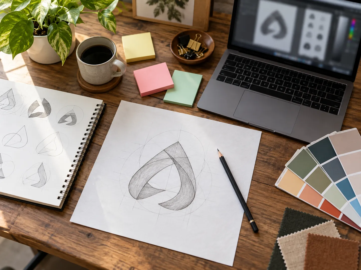
How to Create a Professional Logo with an AI Logo Generator
Step 1: Write a focused logo brief
Use a short prompt that combines brand context with a visual instruction. A helpful structure is: business type, audience, personality, symbol or concept, style, and color direction. For example: “A minimalist logo for an independent coffee subscription for busy urban professionals; a simple steam-and-circle symbol; warm, refined, and modern; deep brown and muted cream.”
Be specific about the idea, not overly specific about decoration. Asking for a premium, memorable, minimal mark gives the generator room to explore while keeping the result on-brand.
Step 2: Choose a style and color direction
Style presets and color palettes are useful guardrails. Pick a direction that serves the business rather than following a trend. Geometric and minimal styles can suit technology or professional services. Organic shapes can feel handmade or community-oriented. Bold high-contrast color may help an entertainment brand, while a restrained palette may be better for a wellness business.
If you are uncertain, create two clearly different directions instead of blending everything into one. Comparing a restrained geometric route with a warmer organic route makes it easier to see what your brand is really asking for.
Step 3: Generate concepts, then compare them like a designer
Do not choose the first image that looks polished. Generate a small set of concepts and review them against your brief. Ask which result still makes sense with the brand name removed. Check whether the central form is easy to recall. Notice whether a detail becomes muddy when you imagine it as a profile image.
Choose one promising direction and one backup direction. This preserves exploration without turning the process into endless browsing.
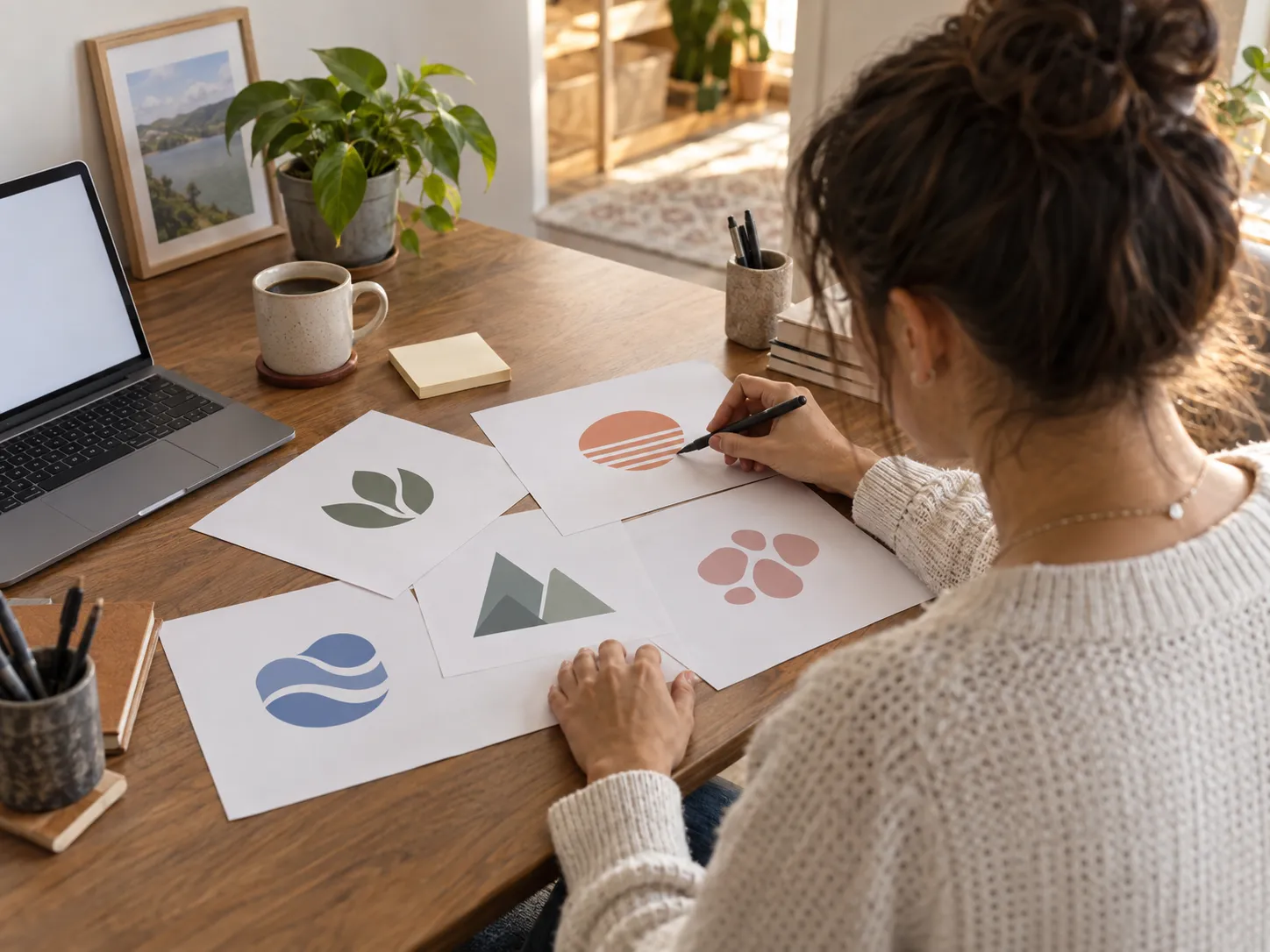
Step 4: Refine the strongest direction
Use the best concept as a decision point. Simplify unnecessary detail, clarify the silhouette, and adjust the color relationship before asking for more variation. If the concept is close but lacks personality, improve the prompt with one targeted instruction such as “more confident,” “less ornamental,” or “clearer at small sizes.”
AI Enhance can help refine the wording of a prompt and offer creative inspiration. It is still your job to decide whether the result feels ownable and appropriate. Change one major variable at a time so you can understand why an iteration improved or weakened the concept.
Step 5: Test the logo in real-world contexts
Place the selected design beside a browser tab, a circular social avatar, a simple invoice, and a small product label. You do not need a full brand system to test these moments. The goal is to see whether the mark holds together when it is not presented as a large, isolated image.
Check for thin details, low-contrast colors, and shapes that rely on effects to be recognizable. A good logo remains clear in a single color and does not depend on a complicated background.
Start exploring your logo direction
When to Start with an Image Instead of a Text Prompt
Sometimes the clearest idea already exists outside a written brief. You may have a hand-drawn icon, a product photo, a rough mascot sketch, or a reference shape that captures the direction. In that case, starting from an image can be more useful than describing every visual detail in text.
An image-to-logo workflow is especially helpful when the source contains a memorable silhouette. Treat the image as a reference, not as a finished logo: the final mark should remove visual noise, simplify the form, and remain readable at a small scale.
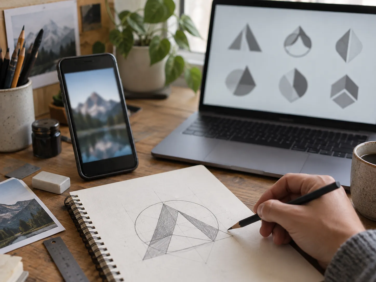
Turn a sketch or reference image into a logo
Common AI Logo Maker Mistakes to Avoid
The most common mistake is trying to include the entire business story in one symbol. A logo is an identifier, not an illustration. Give the AI logo generator one strong idea to work with.
Another mistake is using vague prompts such as “make it cool” or “make it professional.” Replace them with useful creative constraints: the audience, personality, symbol, style, and color mood. Finally, avoid deciding from a large preview alone. A logo that feels impressive at full screen may fail when it becomes a tiny icon.
Choose the Right Export Format
Think about where the approved logo will be used. JPEG Standard is practical for simple digital sharing. PNG Transparent is useful when the logo must sit cleanly on a colored or photographic background. SVG Vector is the flexible choice for scalable use, such as print or large displays, because it can retain crisp edges at different sizes.
Keep a simple, organized set of final files. Save the approved version, a one-color version, and variations that are genuinely needed for horizontal or square placements. Consistency is more valuable than producing endless alternatives.
Frequently Asked Questions
Can an AI logo generator create a logo for a real business?
It can help you develop and refine logo concepts quickly. Before using a design publicly, review how distinct it is in your market and complete any legal or trademark checks appropriate for your business.
How many ideas should I generate?
Generate enough to compare clear directions, then refine the strongest one. A focused review is more useful than collecting hundreds of unrelated images.
Is an AI logo maker useful if I am not a designer?
Yes. It can make visual exploration more accessible, especially when you begin with a clear brand direction and use simple tests to judge the final result.
Should I use text or a reference image?
Use text when the idea is mainly conceptual. Use a reference image when a sketch, photo, or silhouette carries the visual starting point you want to preserve and simplify.
Create a Logo That Can Grow with Your Brand
An AI logo generator gives you a faster way to explore, but a professional logo comes from disciplined choices. Define the audience, choose one memorable idea, compare concepts carefully, and test the result where customers will actually see it. The final mark does not need to explain everything. It needs to be clear enough to become familiar.