
How to Design an Abstract Logo That Feels Distinctive
An abstract logo uses shapes, lines, color, movement, or negative space to express a brand idea without drawing a literal object. Instead of showing exactly what a company sells, the symbol may communicate qualities such as connection, speed, precision, growth, calm, or creativity.
This freedom makes the format versatile, but it also creates a real design challenge. A successful abstract logo must feel intentional rather than random. It needs one clear idea, a recognizable silhouette, and enough simplicity to work on a website, social profile, app icon, package, or business card.
This guide explains how abstract logos work, when this direction suits a brand, how to develop an effective abstract logo design, and how to turn a written concept into original visual directions with AI.
Table of Contents
- What Is an Abstract Logo?
- Why Choose an Abstract Logo?
- Core Elements of Abstract Logo Design
- Common Abstract Logo Styles
- Abstract Logo Ideas by Industry
- Letter V Abstract Logo Ideas
- Abstract Sushi Logo Ideas
- How to Create an Abstract Logo With AI
- Abstract Logo Examples and AI Prompts
- Common Abstract Logo Mistakes
- Abstract Logo Design Checklist
- Frequently Asked Questions
What Is an Abstract Logo?
An abstract logo is a non-literal brand symbol made from simplified shapes, lines, patterns, or visual relationships. It does not need to resemble a real-world object. Instead, the mark translates an idea, action, or feeling into a compact graphic form.
A pictorial mark may show a leaf, mountain, animal, camera, or cup. An abstract logo may use two interlocking curves to suggest partnership, a rising form to suggest progress, or a modular pattern to suggest a connected system.
The difference matters. A non-literal mark is not simply decoration with a clever explanation added later. The shapes should follow an internal logic that connects the symbol to the brand. Viewers may not decode every layer immediately, but the result should still feel coherent, memorable, and appropriate.
How Abstract Logos Communicate Meaning
Abstract logos usually communicate through a small set of visual signals:
- Direction: Upward or forward movement can suggest growth and momentum.
- Connection: Interlocking forms can represent teamwork, networks, or integration.
- Balance: Symmetry and stable geometry can suggest trust or precision.
- Transformation: Folding, rotation, or changing forms can express innovation.
- Flow: Curves and continuous lines can suggest ease, rhythm, or service.
- Focus: Converging elements can suggest clarity, coordination, or purpose.
A strong abstract logo should not carry five unrelated meanings. One focused idea is easier to recognize, easier to explain, and easier to apply consistently.
Abstract Logo vs. Pictorial Logo
| Design factor | Abstract logo | Pictorial logo |
|---|---|---|
| Main visual | Shapes, lines, or geometry | Recognizable object or image |
| Meaning | Conceptual or symbolic | More literal and immediate |
| Flexibility | Can support broader future growth | May connect the brand to one object |
| Recognition | Often learned over time | Often understood more quickly |
| Main risk | Looking arbitrary | Looking generic or familiar |
| Good fit | Technology, SaaS, finance, consulting, creative brands | Food, retail, pets, travel, local services |
Choose an abstract logo when the business sells a process, platform, service, or idea that is difficult to represent with one object. Choose a pictorial mark when a familiar image gives the audience a useful shortcut.
Why Choose an Abstract Logo?
An abstract logo can give a business a symbol that feels proprietary rather than borrowed from a common industry template. This is especially useful in markets where competitors repeatedly use the same icons.
Distinctive Brand Recognition
A custom symbol can develop a recognizable silhouette that belongs to the brand. Instead of using another cloud for software or another leaf for wellness, the design can create a unique shape from the brand’s own concept.
Distinctiveness does not require complexity. A simple abstract logo with one unusual relationship between shapes may be more memorable than a detailed mark with many decorative elements.
Room for Future Growth
A literal symbol can become limiting when a company expands. A business that begins with one product may later add services, software, education, or a marketplace.
An abstract logo can represent a broader value such as connection, confidence, discovery, or progress. Because the meaning is not tied to one product, the symbol may continue to fit as the company evolves.
Flexible Use Across Markets
Abstract logos do not depend on a specific language. A compact visual form can work across websites, apps, packaging, signage, social channels, and international markets.
This does not make every design universally understandable. Cultural associations, color meanings, and accidental similarities still require review. However, a simple symbol often travels more easily than a long brand name or complex illustration.
Core Elements of Abstract Logo Design
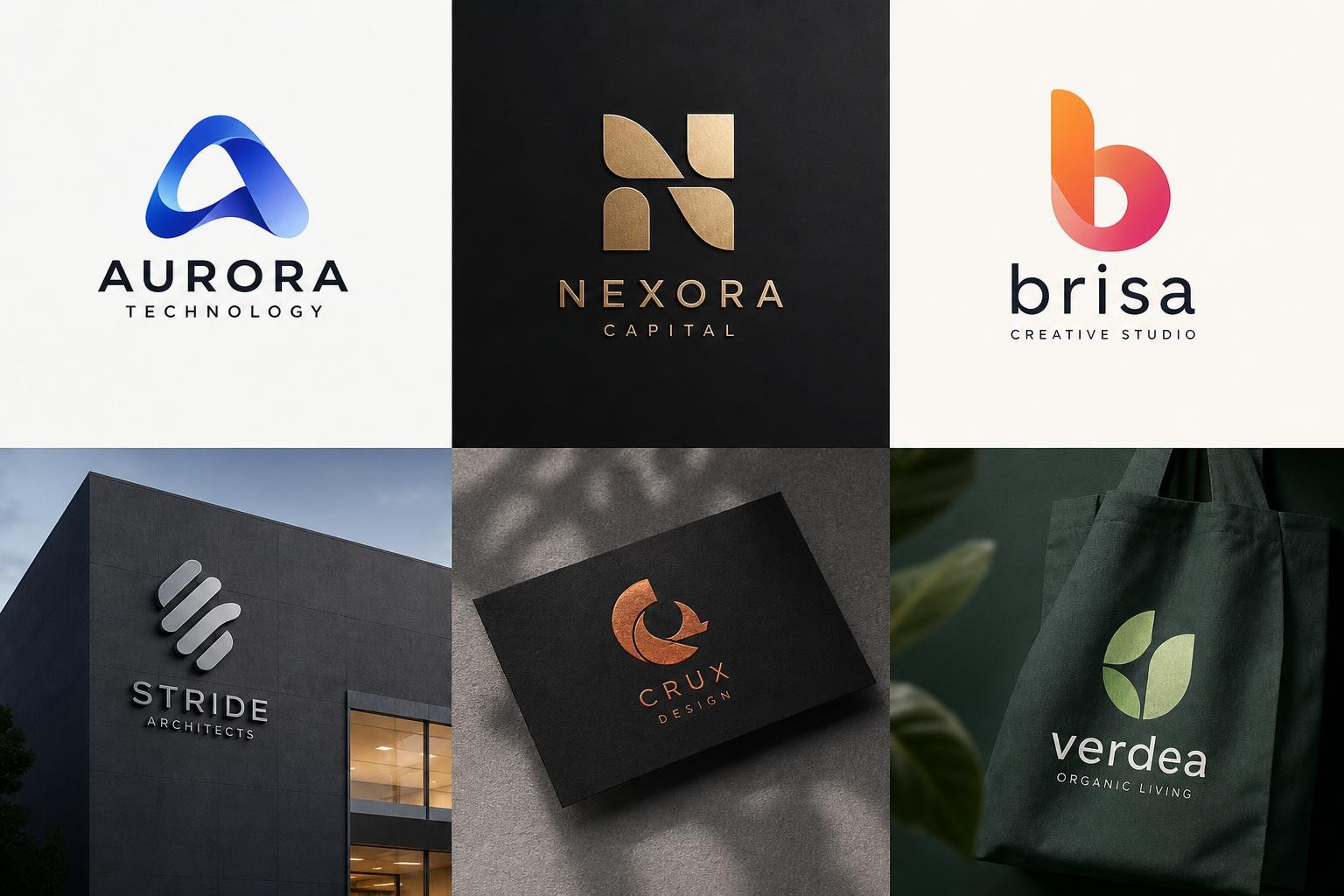
Effective abstract logo design depends on a few controlled elements rather than a large collection of visual effects.
Shape and Silhouette
The silhouette is the outer form people notice first. A good abstract logo should remain identifiable when filled with one solid color.
Test the design as a black shape on a white background. If it becomes a confusing blob, the structure may rely too heavily on gradients, color changes, or tiny internal details.
Negative Space
Negative space is the empty area around or inside the symbol. It can reveal a second meaning, separate overlapping forms, or make a dense composition easier to read.
A carefully placed cutout might reveal a path, letter, arrow, or hidden connection. The idea should improve recognition rather than exist only as a visual trick.
Movement and Direction
Diagonal lines, repeated modules, rotation, and curves can make an abstract logo feel active. Horizontal structures often feel stable, vertical structures may feel confident, and circular movement can suggest continuity.
Match the motion to the personality. A financial platform may need controlled movement. A sports brand may benefit from stronger speed and tension. A wellness identity may use softer flow.
Color and Contrast
Color can reinforce the design, but the core form should still work without it.
Use contrast to separate important parts. Avoid adding several colors merely to make a weak shape more interesting. A one-color version is essential for stamps, embroidery, small print, and restricted production methods.
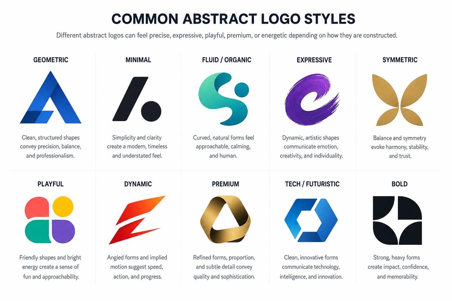
Common Abstract Logo Styles
Different abstract logos can feel precise, expressive, playful, premium, or energetic depending on how they are constructed.
Geometric
A geometric abstract logo uses angles, circles, grids, or repeated forms. It often suits technology, architecture, finance, logistics, and B2B services.
The main risk is sameness. Generic hexagons, orbit shapes, and connected dots appear everywhere. Add meaning through custom proportions, negative space, or an unusual relationship between forms.
Organic
An organic abstract logo uses soft curves, irregular shapes, or natural movement. It can suit wellness, beauty, sustainability, food, hospitality, and creative work.
Organic does not have to mean “leaf.” A flowing form can suggest breath, rhythm, care, renewal, or human movement without depicting a plant.
Monoline
A monoline design uses one continuous or consistently weighted line. It can feel elegant, modern, and approachable.
The line should not become too thin. Test the mark on mobile screens and small printed materials to ensure the structure does not disappear.
Letter-Based
A letter-based abstract logo transforms an initial into a brand symbol. A letter v abstract logo, for example, may become a path, wing, folded ribbon, checkmark, valley, or pair of converging forms.
The letter should remain discoverable without looking like an ordinary typed character. The strongest result feels like a symbol first and a clever letterform second.
Abstract Logo Ideas by Industry
The strongest abstract logo ideas begin with a brand concept, not with a fashionable shape.
Technology and SaaS
Technology brands often need to represent invisible systems such as automation, data, workflow, security, collaboration, or intelligence.
Useful directions include connected modules for integration, a continuous path for workflow, layered forms for infrastructure, a protected central space for security, or converging points for coordination.
Avoid defaulting to a glowing brain, circuit pattern, or random orbit. The symbol should make the product feel more specific, not more generic.
Food and Restaurants
An abstract logo for food can communicate appetite, craft, freshness, movement, or cultural influence without drawing the dish literally.
Possible directions include repeated arcs suggesting plates, a folded form suggesting preparation, circular rhythm suggesting serving, or negative space suggesting chopsticks, steam, or a bowl.
An abstract sushi logo is especially promising because sushi already has strong geometry: circles, layers, slices, rolls, and precise cuts.
Wellness and Beauty
Wellness and beauty brands often use soft abstract logos to suggest calm, balance, care, or transformation.
Useful directions include mirrored curves, open circular forms, flowing lines, subtle symmetry, and gradual expansion. Avoid detail so delicate that it disappears on packaging or social icons.
Creative and Consulting Brands
Creative studios and consultants can use an abstract logo to represent perspective, strategy, collaboration, or transformation.
A strong direction may combine two different forms into one balanced symbol. This can suggest the relationship between insight and action, client and team, or problem and solution.
Letter V Abstract Logo Ideas
A letter v abstract logo can do more than place a stylized V inside a circle. The letter already has useful qualities: two directions meet at one point, its open top can imply possibility, and its angled sides can create movement.
Build Meaning Into the Letter
Consider these directions:
- Path: Two lines converge into a route, suggesting focus or progress.
- Wing: The V becomes upward forms, suggesting freedom or speed.
- Checkmark: One side extends to suggest approval, completion, or performance.
- Valley: The form becomes a landscape for travel, nature, or property.
- Folded ribbon: Overlapping planes add depth and a premium feeling.
- Partnership: Two separate shapes meet to express collaboration.
A useful letter v abstract logo should work even when viewers do not notice the letter immediately. It still needs a clear silhouette, controlled spacing, and a personality that matches the brand.
Abstract Sushi Logo Ideas
An abstract sushi logo offers more creative room than a literal plate of sushi. The goal is not to hide the category completely, but to reduce familiar forms into a distinctive visual system.
Move Beyond the Generic Sushi Roll
A standard roll icon communicates quickly, but it can look like hundreds of restaurant marks. Consider a more specific direction built from the visual language of sushi:
- Concentric circles inspired by a sliced roll
- Two clean lines suggesting chopsticks and motion
- Layered rectangles inspired by nigiri
- A curved form combining a wave and plate
- Negative space forming a fish tail
- Repeated modules suggesting a sushi set
- A folded shape inspired by seaweed wrapping rice
For a premium restaurant, use restrained geometry and generous spacing. For a casual delivery brand, use bolder forms and a more energetic composition.
The abstract sushi logo should still feel appetizing and approachable. Avoid a symbol that looks industrial, medical, or too cold for a dining experience.
How to Create an Abstract Logo With AI
AI can accelerate concept exploration, but the quality of an abstract logo still depends on the brief. The tool needs meaning, structure, and constraints—not only a request to make something modern.
Step 1: Define the Brand Idea
Write down what the business does, who it serves, how the brand should feel, what the symbol should communicate, and where the final mark will appear.
For example:
A scheduling platform for independent fitness coaches. The brand should feel focused, energetic, and dependable.
Step 2: Choose a Visual Metaphor
Translate the brand idea into one visual relationship. Possible metaphors for the scheduling platform include two paths meeting, repeated blocks becoming organized, a pulse entering a grid, or a circle opening into forward motion.
Do not combine all four in one abstract logo. Choose one direction and explore variations.
Step 3: Write a Focused Prompt
A weak prompt:
Make a cool abstract logo for my app.
A stronger prompt:
Create an original abstract logo for a scheduling platform for independent fitness coaches. Use two compact geometric paths that align into one forward-moving symbol, representing energy and organized progress. Strong silhouette, balanced negative space, flat vector-like shapes, no mockup, plain background.
A useful prompt identifies the brand, industry, audience, personality, core metaphor, shape language, composition, simplicity, and presentation constraints.
Step 4: Compare Multiple Directions
Generate several options from the same brief: a geometric route, monoline flow, letter-based symbol, and compact negative-space form.
Compare the results rather than judging one image in isolation. Look for the direction with the strongest silhouette and clearest connection to the brand.
Step 5: Test and Prepare Your Logo for Real-World Use
Generating an abstract logo is only the beginning. Before using it across your brand, test how the symbol performs in real situations.
A strong abstract logo should remain recognizable when it is:
- Displayed as a 32-pixel favicon
- Used as a social media profile image
- Printed on business cards and packaging
- Shown in black and white
- Scaled for banners or signage
If your design only looks good in a large mockup, simplify the shapes before moving forward.
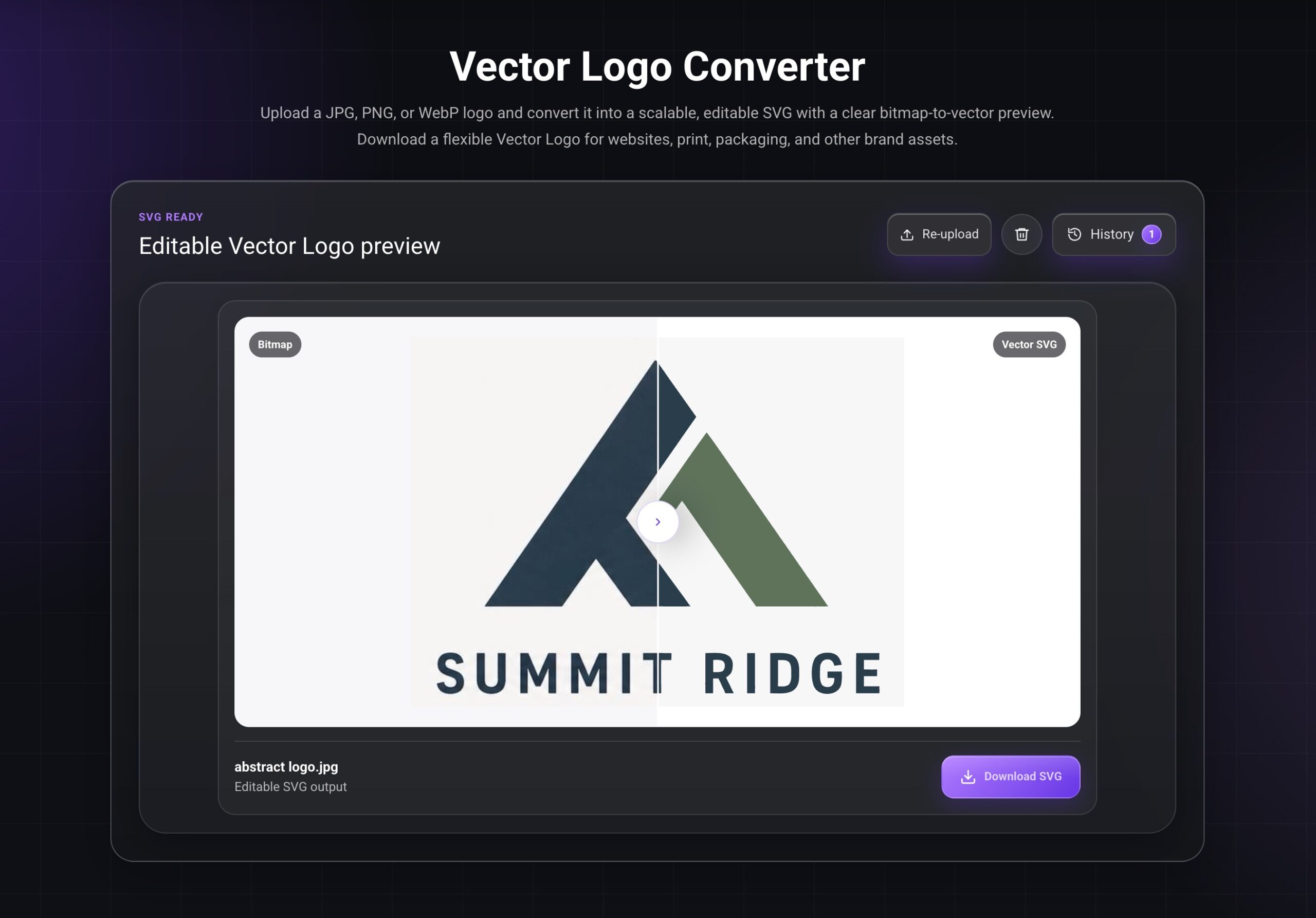
Another important step is preparing the final file format. Many AI-generated logos are initially exported as PNG images, which work well for previews but may lose quality when enlarged for printing, embroidery, merchandise, or large-format signage.
Once you’ve chosen your preferred design, it’s a good idea to convert it into a scalable vector format such as SVG. A vector version stays sharp at any size and is much easier to edit for future brand assets.
If you’ve already created your concept, the Vector Logo Converter can help transform your raster logo into a clean, editable vector graphic that’s better suited for professional branding, printing, and production.
Abstract Logo Examples and AI Prompts
The examples below use fictional brands so the design logic can be explained without copying an existing identity.
FlowArc: SaaS Collaboration
Brand: FlowArc
Industry: Workflow software for distributed teams
Concept: Two curved modules joining into one forward path
Create an original, non-infringing abstract logo for a fictional SaaS brand called FlowArc. Build the symbol from two curved geometric modules that connect into one forward-moving path, representing coordinated work and smooth progress. Clean vector-like shapes, strong silhouette, balanced negative space, modern and calm, plain background, centered composition, no mockup, no watermark.
This direction turns collaboration into a visual relationship rather than using a literal team or computer icon. The two forms remain separate enough to suggest multiple contributors while sharing one direction.
Vela: Letter X Brand Symbol
Brand: Xtra
Industry: Performance analytics platform
Concept: A letter x abstract logo formed from two ascending planes
Create an original, non-infringing letter x abstract logo for a fictional analytics platform called Xtra. Form the X from two precise ascending planes that meet at a focused central point, suggesting clarity, performance, and upward momentum. Minimal geometric construction, subtle negative space, strong compact silhouette, flat vector-like design, plain background, no mockup, no watermark.
This direction remains connected to the name without looking like a standard typed monogram. The ascending planes create momentum, while the central meeting point suggests focus.
Nori Loop: Modern Food Brand
Brand: Nori Loop
Industry: Contemporary dining and food delivery brand
Concept: An abstract food logo built from a clean circular form and a sweeping fluid line
Create an original, non-infringing abstract food logo for a fictional restaurant called Nori Loop. Combine a simple circular form inspired by fresh ingredients with one sweeping curved line suggesting fluid preparation and balance. Modern restraint without copying traditional emblems, bold flat shapes, strong silhouette, minimal detail, plain background, centered logo, no mockup, no watermark.
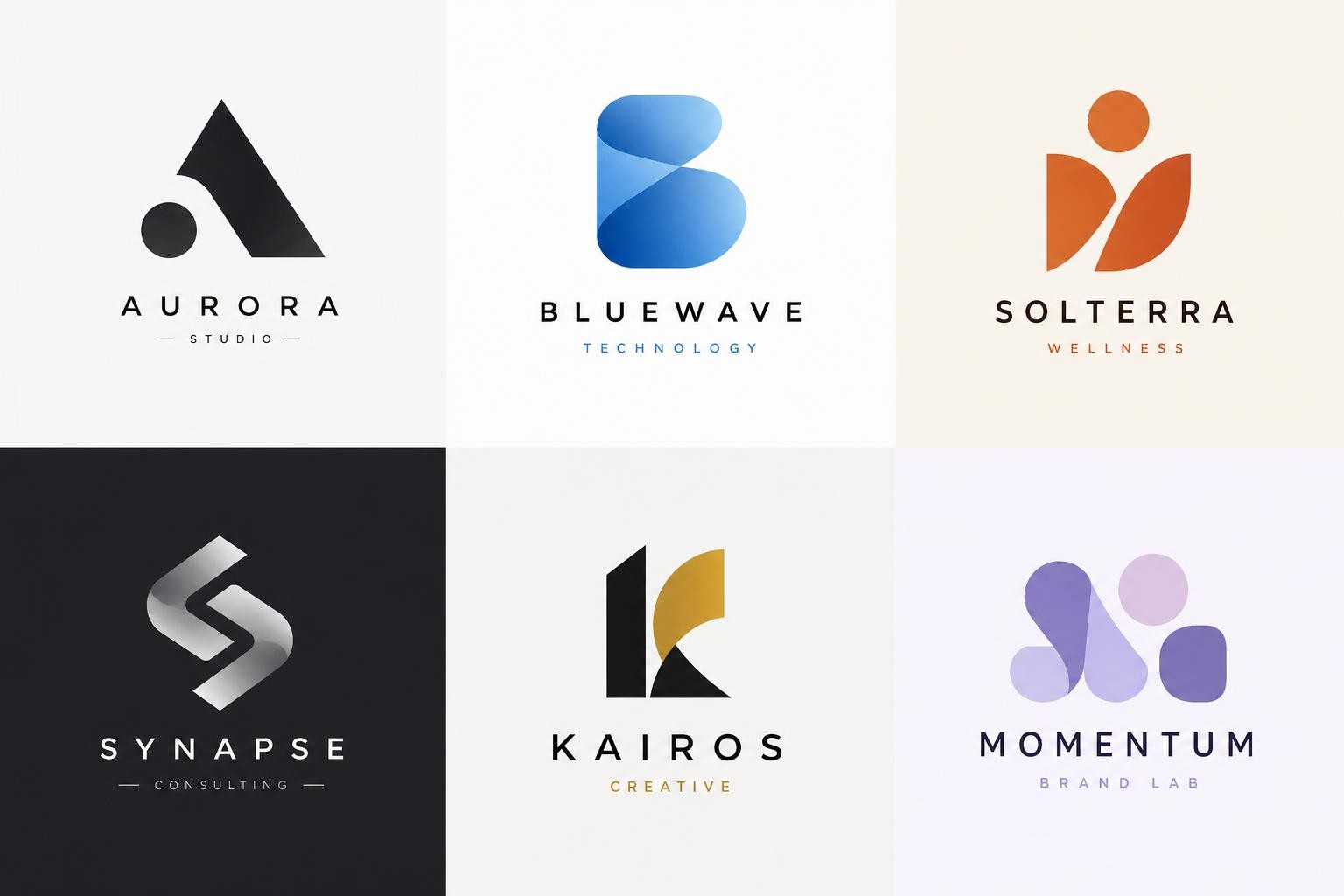
This abstract logo design hints at sushi without relying on a detailed fish, chef, plate, or chopstick illustration. The circular structure supports recognition, while the outer curve gives the mark a more ownable rhythm.
Common Abstract Logo Mistakes
An abstract logo can look polished while still failing as a practical brand asset.
Random Geometry
Several shapes placed together do not automatically create meaning. The design needs one clear relationship: connection, movement, balance, focus, or transformation.
Too Many Meanings
Trying to represent the product, founder story, location, audience, mission, and five values usually creates visual noise. Let the symbol express one central idea.
Weak Small-Size Performance
Thin gaps, tiny cutouts, and complex overlaps may disappear on a favicon or label. Reduce the mark early and simplify what does not survive.
Depending on Gradients
A gradient may improve presentation, but it should not be the only reason the symbol looks interesting. Test the abstract logo in one color.
Copying a Familiar Pattern
Orbit shapes, generic swooshes, folded ribbons, and connected-node icons are common. Search competitors and review similar marks before adopting a direction.
Ignoring the Wordmark
The symbol and business name must work together. Test spacing, proportion, typography, alignment, and visual weight before finalizing the system.
Treating AI Output as Final
AI is useful for exploring abstract logos quickly, but every option still needs human review. Check accidental letters, uneven geometry, confusing negative space, similarity to other brands, production quality, and possible trademark concerns.
Abstract Logo Design Checklist
Use this checklist before choosing an abstract logo:
- The concept connects to one clear brand idea.
- The silhouette remains recognizable in one color.
- The symbol works at favicon size.
- The design does not depend on tiny details.
- The mark pairs well with the business name.
- The composition works in square and circular spaces.
- The design is usable on light and dark backgrounds.
- The direction does not closely imitate a competitor.
- The abstract logo design fits the audience and industry.
- The final asset can be prepared in a scalable vector format.
- The concept has been reviewed for originality and potential trademark risk.
If the design fails several checks, return to the concept rather than decorating the same weak structure.
Frequently Asked Questions
What Is an Abstract Logo?
An abstract logo is a brand symbol made from non-literal shapes, lines, geometry, or negative space. It expresses a concept or quality without directly illustrating a real object.
What Makes a Good Abstract Logo?
A good abstract logo has a clear concept, distinctive silhouette, balanced composition, controlled detail, and strong small-size performance. It should connect to the brand even when its meaning is symbolic.
Are Abstract Logos Good for New Businesses?
Yes, but a new business should usually pair the symbol with a clear wordmark. The company name helps audiences learn the abstract logo until the visual identity becomes familiar.
What Is the Difference Between Abstract Logos and Pictorial Logos?
Abstract logos communicate through conceptual shapes, while pictorial logos use recognizable objects. The first can offer more flexibility, while the second may be understood faster.
How Do I Create a Letter V Abstract Logo?
Start with the meaning behind the V. It can become a path, wing, valley, checkmark, folded ribbon, or two converging forms. Keep the letter discoverable without making the design look like ordinary typed text.
How Can an Abstract Sushi Logo Still Look Like Sushi?
Use visual cues such as circular slices, layered rectangles, seaweed wrapping, chopstick movement, or negative-space fish forms. An abstract sushi logo can suggest the category without illustrating a complete meal.
Which Colors Work for Abstract Logo Design?
Color depends on the brand personality and market. Technology may use strong contrast, wellness may use softer tones, and food brands may use warmer palettes. The abstract logo should still work in black and white.
Can AI Generate Original Abstract Logos?
AI can generate original concept directions from a detailed prompt, but the output needs review. Check visual similarity, geometry, scalability, spelling, export quality, and potential trademark conflicts before commercial use.
Create an Abstract Logo From Your Brand Idea
An abstract logo works best when it turns one meaningful brand idea into a simple, recognizable visual relationship. It does not need to show exactly what the business sells. It needs to create a symbol the brand can use consistently and the audience can learn over time.
Begin with strategy: define the brand, choose one metaphor, explore several abstract logo directions, and test every option in real contexts. Strong abstract logo design remains clear without a mockup, gradient, or lengthy explanation.
Use the LogoCreator to explore broader logo directions, or move directly to the Text to Logo Generator to turn your brand description into an abstract logo.