
Full Best Animation Logos: 62 Logos, Effects & Variants
Full best animation logos is more than an awkward search phrase. It is the name viewers use for a fast-moving compilation built around 62 recognizable logo sequences. The video inspired remixes, synchronized players, reversed edits, color treatments, pitch-shifted sound, and countless effect lists. That history explains why searches for the phrase often look different from ordinary searches for animated brand design.
This guide separates those two ideas. First, it explains the compilation, the familiar lineup, and the editing culture that grew around it. Then it turns that inspiration into practical lessons for making an original logo animation: protect the identity, choose one meaningful movement, control the pace, and end on a clean frame people can recognize.
The brands and fan-editing terms discussed below are examples for commentary and analysis. LogoCreator is not affiliated with the original compilation, its editors, the named brands, or the communities that created later variations.
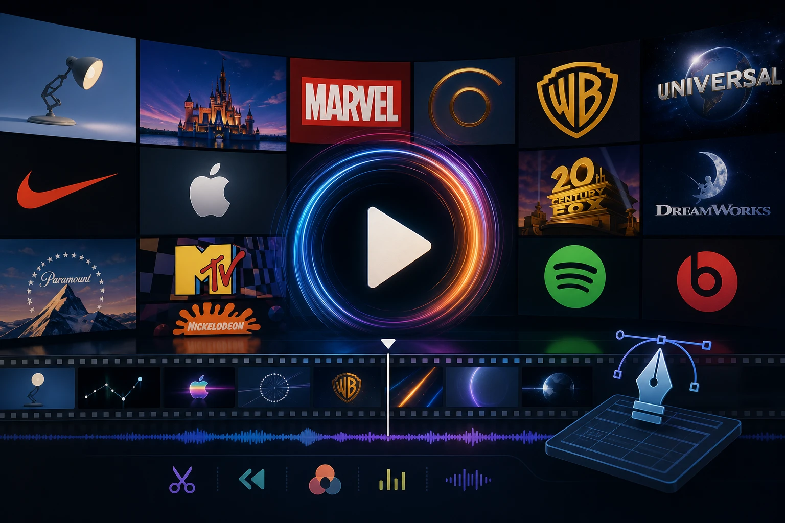
Table of Contents
- What Are Full Best Animation Logos?
- The Original 62-Logo Lineup
- Why the Compilation Became an Editing Phenomenon
- Full Best Animation Logos Effects and Variants
- Reversed, G Major, and Multiplier Edits
- What Effective Animated Logos Get Right
- How to Create an Original Logo Animation With AI
- Logo Animation Quality Checklist
- Turn Logo Inspiration Into Original Brand Motion
What Are Full Best Animation Logos?
The phrase usually points to a particular kind of logo-compilation video rather than a formal design category. The best-known version moves through dozens of corporate, technology, entertainment, food, automotive, and consumer identities in one continuous sequence. Each segment presents a logo with motion, sound, or both before passing to the next brand.
That format is important because it changes how viewers experience identity design. A single animated logo is normally judged in the context of one company. In a compilation, the viewer compares entrances, reveals, audio cues, color changes, speed, and final frames in rapid succession. Familiar marks become raw material for pattern recognition: one assembles from geometry, another arrives through a camera move, and another depends on a signature sound.
The word “full” distinguishes the long sequence from shorter copies, excerpts, and edits containing fewer entries. “Best” belongs to the title and community language; it is not an objective ranking produced by a design jury. “Animation logos” describes the moving brand marks in the sequence, although designers more commonly say “animated logos” or “logo animations.”
This distinction prevents a common SEO mistake. Someone searching the exact phrase may want the known compilation or one of its fan-made transformations. Someone looking for professional motion inspiration may instead want design principles or a way to animate a business logo. A useful article should answer the first intent before bridging to the second.
It also helps to separate viewing from making. Watching moving marks can reveal timing ideas, but copying a recognizable sequence is not a brand strategy. Original motion should grow from the logo’s shapes, personality, and intended use. Understand why a movement feels connected to a mark, then develop a distinct direction.
The Original 62-Logo Lineup
The best-known full best animation logos lineup is remembered for its scale and variety. Community lists commonly identify 62 entries, beginning with Coca-Cola and moving through financial, automotive, technology, media, food, retail, and entertainment brands before ending with PlayStation. The sequence gives viewers a compact tour of how different identities can appear in motion.
The commonly documented order is shown below. The four-column layout keeps the complete sequence easy to scan without turning most of the page into a long vertical list.
| 1–16 | 17–32 | 33–47 | 48–62 |
|---|---|---|---|
| 1. Coca-Cola | 17. Google | 33. Datsun | 48. Omation Entertainment |
| 2. MasterCard | 18. BMW | 34. Microsoft | 49. Nickelodeon |
| 3. Nissan | 19. Toyota | 35. Xbox 360 | 50. NTT |
| 4. LG | 20. Opel | 36. Microsoft Edge | 51. BP |
| 5. Acer | 21. 20th Century Fox | 37. Apple | 52. Shell |
| 6. HP | 22. KFC | 38. Yahoo! | 53. Fanta |
| 7. Verizon | 23. Big Idea Entertainment | 39. M&M’s | 54. Sprite |
| 8. Panasonic Ideas for Life | 24. Danone | 40. Subway | 55. Coca-Cola Zero |
| 9. T-Mobile | 25. Doritos | 41. YouTube | 56. DVD Video |
| 10. Paramount 100 Years | 26. Audi | 42. HBO | 57. Domino’s |
| 11. Volkswagen | 27. Škoda | 43. Burger King | 58. Barney |
| 12. McDonald’s 2014 | 28. Mazda | 44. Maestroq | 59. Cinar |
| 13. Pepsi | 29. Intel Leap Ahead | 45. Cirrus | 60. Taco Bell |
| 14. Mountain Dew | 30. Renault | 46. Mondex | 61. Motorola |
| 15. Target | 31. Citroën | 47. AT&T | 62. PlayStation 2016 |
| 16. FedEx | 32. Samsung | — | — |
Later uploads may add, remove, reorder, or relabel entries. Treat titles such as “64,” “2 logos added,” or “complete” as claims about a particular remix, not the original 62-item sequence.
For designers, the lineup is most useful as a comparison set across automotive, technology, food, media, entertainment, and consumer identities. Notice which marks depend on typography, which rely on a compact symbol, and which use a larger cinematic environment. A wordmark requires different motion from a badge, while a geometric icon can often assemble, rotate, or align. The static construction should guide the movement.
Why the Compilation Became an Editing Phenomenon
The compilation succeeds partly through recognition. Viewers already know many of the marks, so even a brief clip produces an immediate response. The rapid sequence also creates anticipation: the audience learns the rhythm and waits to see how the next familiar identity will move or sound.
The consistent structure makes the compilation unusually remixable. Editors can preserve the timing while changing color, orientation, pitch, playback direction, distortion, or screen layout. Because every section has a recognizable source and a clear boundary, a variation can apply one rule across the full timeline. That repeatable rule is the basis of many effects videos.
Search behavior reflects that culture. Queries such as too many full best animation logos often refer to many synchronized copies playing at once. Numbered versions may describe the number of sources, panels, or rounds. These are community labels, not standardized motion-design terms.
The phenomenon also shows why an identifiable final frame matters. Even after heavy treatment, viewers can often recognize a segment because the original silhouette, wordmark, color arrangement, or audio cue survives. When every defining signal disappears, the edit becomes noise. The same principle applies to commercial motion: surprise can attract attention, but recognition carries the brand.
Creators should therefore borrow the structural lesson rather than the branded material. Establish a clear source, choose a consistent transformation, and preserve the essential identity. An original logo can pulse, unfold, trace, assemble, or catch light without imitating a famous animation. A strong rule produces coherence; random effects only produce activity.
Full Best Animation Logos Effects and Variants
Effect-related searches lead into a broad fan-editing vocabulary. Names differ between creators, but the transformations usually fall into a few recognizable groups: color processing, geometric distortion, compositing, time manipulation, and sound processing.
Color and Tone Effects
Color edits may invert the image, swap channels, increase contrast, create a monochrome result, or push every segment toward one palette. These effects are easy to recognize because the motion stays familiar while the visual mood changes. A cool treatment can feel electronic or distant; a warm treatment can feel energetic; high contrast can make the sequence more aggressive.
For brand work, use color changes carefully. Strong motion identities do not discard established brand colors without a reason. A temporary glow, light sweep, or tonal transition can create depth, but the final frame should return to an approved palette unless the campaign intentionally introduces a new system.
Shape, Mirror, and Distortion Effects
Mirror edits, kaleidoscopic layouts, pinches, swirls, waves, and stretching effects alter the geometry of each segment. These transformations can reveal unexpected patterns, especially when a logo contains symmetry. They can also make lettering unreadable or turn a simple mark into an unrecognizable texture.
In original Logo motion, distortion works best as a controlled transition rather than a permanent state. Stretching might communicate speed; a ripple might support a fluid brand; a split might suggest transformation. The movement needs a concept. Otherwise it may compete with the identity.
Layering and Screen Multiplication
Multiplier edits arrange several videos or versions on one screen. The panels may play together, begin at different moments, use different effects, or combine into a dense audiovisual wall. The related multiplier search phrase describes synchronized multi-player arrangements built from familiar source videos.
For a real brand, multiplication can still inspire useful motion. A symbol made from repeated modules may assemble from a grid. A product family may use several coordinated marks. A social campaign may tile one short animation into a pattern. The professional version needs hierarchy, spacing, and a clear focal point instead of maximum visual overload.
Timing and Audio Treatments
Speed changes, pauses, loops, echoes, reversed playback, pitch shifts, and layered sound can transform the same images into a different experience. Sound is especially powerful because it tells the viewer when to expect an impact, transition, or reveal. However, not every Logo needs a sonic identity. Silent motion should still read clearly in muted feeds and presentation environments.
Reversed, G Major, and Multiplier Edits
Three variation families appear repeatedly around the compilation: reversed versions, G Major edits, and multiplier layouts. They overlap, but each changes a different part of the viewing experience.
Full Best Animation Logos Reversed
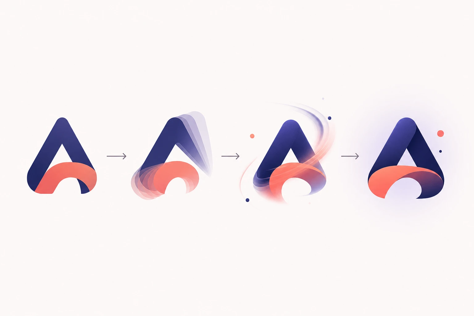
A reversed edit plays the timeline, individual segments, audio, or some combination of them backward. Assembly becomes disassembly. Reveals appear to collapse. The result can feel uncanny because the audience recognizes the source while its cause-and-effect logic has been inverted.
This is a useful motion-design test. Play an original reveal backward and ask whether the movement still has visual clarity. The reverse does not need to become the final asset, but it can expose abrupt cuts, awkward easing, or a weak transition between the moving sequence and the static Logo.
Full Best Animation Logos G Major
This G Major convention generally describes an editing treatment rather than a simple performance in the musical key of G major. Versions may combine pitch manipulation, altered color channels, visual processing, and a creator-specific recipe. The same label does not always produce technically identical results.
For brand motion, the lesson is to define effects by outcome rather than by a mysterious label. Specify whether the Logo should feel bright, metallic, playful, cinematic, digital, soft, or precise. Then describe the movement, pacing, lighting, and final frame that create that mood.
Too Many and Multiplier Versions
A “too many” edit emphasizes scale. Dozens of panels or sources may compete for attention, often with synchronized or layered audio. The attraction is intentional excess: the familiar compilation becomes a visual and sonic endurance experiment.
The phrase full best animation logos YouTube multiplier points more specifically to multi-video playback arrangements. For professional use, copy the coordination rather than the clutter. Two or three controlled repetitions can create rhythm. Sixty simultaneous elements usually destroy the priority a brand needs.
Together, these variants demonstrate that one source can support many transformations. Original identity systems can use the same idea responsibly: create a calm website loop, a faster social reveal, and a presentation outro from one motion concept. The versions should feel related even when their pacing or crop changes.
What Effective Animated Logos Get Right
The best animated logos are not automatically the loudest, longest, or most technically complex. They connect movement to identity and deliver a recognizable result at the moment the viewer needs it.
Motion Begins With the Static Mark
A strong sequence uses existing geometry. A circular symbol might rotate, orbit, or expand. Separate pieces might align. A line-based mark might draw itself. A wordmark might reveal through spacing or controlled masks. When motion follows construction, it feels like an extension of the Logo rather than an effect placed on top.
One Main Idea Controls the Sequence
Good animation logos usually have a clear verb: assemble, unfold, trace, bounce, sweep, focus, or reveal. Secondary details can support that action, but they should not introduce unrelated concepts. A metallic shine, particle burst, camera spin, glitch, and elastic bounce in one short clip rarely create a coherent personality.
Timing Matches Brand Character
Fast timing can communicate energy, entertainment, or urgency. Slower easing may feel premium, calm, or precise. A playful brand can overshoot and settle. A financial or enterprise identity may need more controlled acceleration. The right pace is the pace that makes the mark feel more like itself.
The Final Frame Is Clean
Every reveal should settle into a readable Logo. Check spelling, proportions, color, spacing, and symbol shape after the movement ends. If the last frame remains warped, blurred, cropped, or covered by particles, the animation has failed its most basic branding task.
The Asset Works in Context
A cinematic intro may look impressive on a large screen but feel slow in a short social post. A tiny interface animation may disappear in a presentation. Test the output in its intended placement, with and without sound. Effective motion earns attention without delaying the content it introduces.
How to Create an Original Logo Animation With AI
You do not need to rebuild the famous 62-logo sequence to explore motion. Start with a Logo you own, choose a movement connected to its design, and create a short original asset for your brand.
1. Prepare a Clear Source Logo
Use a clean PNG, JPG, JPEG, or WebP with accurate lettering, recognizable colors, and comfortable space around the mark. Avoid a screenshot containing menus, mockup surfaces, or unrelated text. A clear source gives the motion process a stronger visual reference.
If you do not yet have a suitable mark, use the AI Logo Creator to explore an original direction first. Select a result that works as a static identity before adding movement. Animation cannot repair a confusing silhouette or unreadable wordmark.
2. Choose One Motion Direction
Look at the Logo’s construction and choose one action. A monogram could draw on. Modular pieces could assemble. A bold symbol could make a subtle scale pop. A premium mark might use a restrained light sweep. Write down what should move, how quickly it should move, and how the sequence should settle.
3. Describe the Motion Clearly
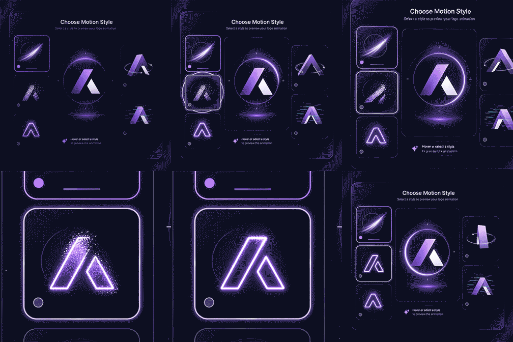
Open the AI logo animation generator, upload the source, and choose a motion style. You can also add an optional Motion Prompt. Describe visible actions instead of relying on a vague request such as “make it amazing.” If the idea is rough, AI Enhance can help refine the prompt and provide clearer creative direction.
For example:
Reveal the symbol with a soft light sweep from left to right. Keep the wordmark stable and readable. Use controlled motion, minimal particles, and finish on the original logo centered in frame.
4. Generate and Review the Complete Result
Generate the animation and watch it from the first frame through the final hold. Check whether small lettering changes, edges distort, colors drift, or the mark fails to settle. Generative motion can introduce variation, so review every result before publishing or placing it in branded content.
5. Download and Test the MP4
Download the MP4 and place it in the actual social post, intro, launch video, or presentation where it will appear. Confirm that the pace fits the surrounding content and that the Logo remains legible at the displayed size. If it does not, simplify the motion prompt and generate another direction.
Logo Animation Quality Checklist
Use this checklist before treating any motion result as a finished brand asset:
- The source Logo is original or properly authorized for your use.
- The animation supports one clear idea rather than a stack of unrelated effects.
- The symbol and wordmark remain recognizable throughout the important frames.
- Lettering is spelled correctly and does not change shape unexpectedly.
- Brand colors return accurately in the final frame.
- The movement fits the brand’s personality and audience.
- The timing is appropriate for the intended platform or presentation.
- The sequence still communicates when viewed without sound.
- The final frame is sharp, centered, and held long enough to read.
- Particles, light, distortion, and camera movement do not hide the Logo.
- The MP4 has been reviewed at both small and large display sizes.
- The result has been tested inside the real content, not only in isolation.
The checklist is especially important when experimental fan effects are used as inspiration. Fan edits are designed to transform, surprise, or overwhelm. Brand motion has a different job: it must create interest while preserving identity.
Do not assume that one animation fits every channel. A presentation outro may allow a longer hold. A social clip may need a faster reveal. A website may require subtle movement that does not distract from navigation. Build related versions from one motion concept instead of adding new effects every time.
Keep source and generated files organized by motion direction and use case. Retain an approved static Logo for comparison so unwanted changes are easier to spot.
Turn Logo Inspiration Into Original Brand Motion
The lasting appeal of full best animation logos comes from a simple combination: familiar identities, rapid comparison, repeatable structure, and endless room for transformation. The 62-logo lineup gave editing communities a shared source. Reversed sequences, G Major treatments, multiplier layouts, and other effects then turned that source into a recognizable genre of its own.
For a brand, the most valuable lesson is not to imitate those sequences. It is to see how strongly motion depends on recognition. Start with a clear mark. Let its shapes suggest the movement. Choose one dominant action, control the rhythm, and protect the final frame. Use sound as support, not as a requirement, and review the result in the place where customers will actually see it.
The same approach separates memorable animation logos from decorative effects. When motion expresses the character of the identity, even a short reveal can feel distinctive. When motion ignores the identity, technical complexity cannot make the result meaningful.
Ready to move from compilation inspiration to an asset made for your own brand? Animate your logo with AI, review the complete MP4, and choose the motion direction that keeps your Logo recognizable from the opening frame to the final hold.