Fashion Brand Logo Styles: 6 Designs & How to Create Yours
Contents
- Why Your Fashion Brand Logo Makes or Breaks Your Brand
- What Makes a Great Fashion Brand Logo — 3 Core Standards
-
6 Fashion Brand Logo Styles Decoded — With Real Brand Examples
- Style 1 — Luxury Minimalist: The Power of Restraint
- Style 2 — Monogram & Lettermark: Initial Impact
- Style 3 — Classic Emblem & Crest: Heritage as a Design Asset
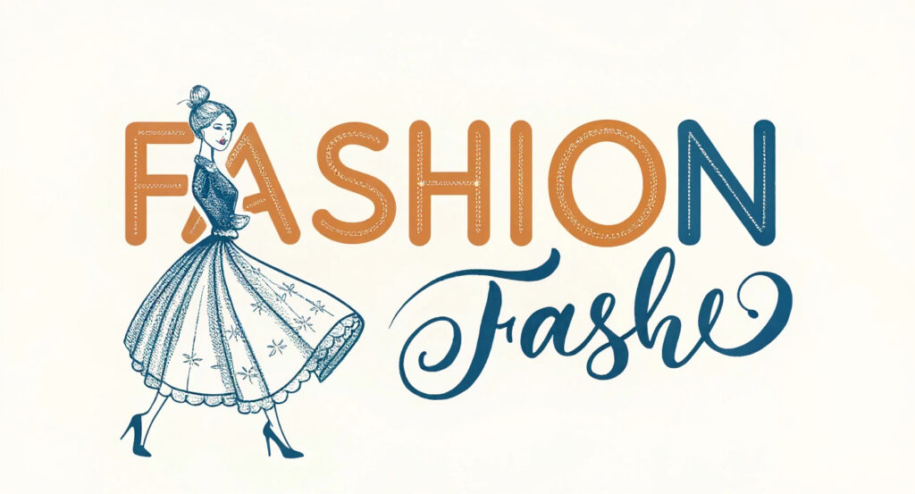
- Style 4 — Feminine & Delicate: The Language of Softness
- Style 5 — Streetwear & Bold Graphic: Attitude as Identity
- Style 6 — Modern Wordmark: Typography as the Entire Brand
- The Design Elements Behind Every Fashion Brand Logo
- How to Create A Fashion Brand Logo Using Image to Logo AI
- Famous Fashion Brand Logos — What They Teach Us About Design Decisions
- FAQ — Fashion Brand Logo Design Questions Answered
- Conclusion — Your Fashion Brand Logo Starts with the Right Style
Why Your Fashion Brand Logo Makes or Breaks Your Brand
The First 7 Seconds: What Your Logo Says Before You Do
Here's a uncomfortable truth about fashion: your customer has already made up their mind before they read a single word you've written.
Research consistently shows that people form first impressions in under 7 seconds — and in the fashion industry, where identity and aspiration are the entire product, that window is even shorter. Your fashion brand logo is the very first thing a potential customer sees on your Instagram profile, your Etsy shop, your product label, or your website header. In those few seconds, it either says "this brand gets me" or "next."
A poorly designed logo doesn't just look amateur — it actively destroys trust. It tells people your products might be as inconsistent as your branding. On the flip side, a well-crafted fashion brand logo works like a silent sales pitch that runs 24/7.
The Real Problem: Most Founders Don't Know Which Logo Style Fits Their Brand
Here's where it gets tricky. Whether you're a startup founder launching a clothing line, an Etsy seller who needs a shop avatar, a content creator building a personal brand, or even a pet owner who wants to turn their dog's adorable face into a custom brand mark — you know you need a logo. What you don't know is which kind.
Most people end up either copying competitors blindly, picking something "pretty," or getting so overwhelmed they put it off entirely. This guide is here to fix that. We're going to break down the six most iconic fashion brand logo styles, decode what makes each of them work, and show you exactly how to create one that actually fits your brand — even if you've never opened a design tool in your life.
What Makes a Great Fashion Brand Logo — 3 Core Standards
Before we get into the style breakdown, let's establish a shared vocabulary. Not all fashion brand logos are created equal, and understanding what separates a forgettable mark from an iconic one will help you make smarter decisions at every step.
Simplicity — Less Is More in Fashion
Look at the most recognizable fashion brand logo styles in the world. Chanel: two interlocked Cs. Calvin Klein: pure typography, nothing else. Celine under Hedi Slimane: the accent mark removed, the serifs gone. Every single one of them got simpler over time, not more complex.
Simplicity isn't laziness — it's discipline. Every element you remove is a deliberate choice to let the remaining elements breathe and carry more weight. If your logo needs to be explained, it's already working against you.
Timelessness, Scalability & Brand Alignment
Three more standards, each equally important. Timelessness means your logo should still make sense in ten years. Fashion brand logo trends change every season, but a great fashion brand logo transcends the moment it was created — that's why Chanel's interlocked Cs, designed in 1925, still feel current.
Scalability is practical: your logo needs to look sharp on a 16x16px favicon and on a 10-foot billboard. Test yours at both extremes before committing. Brand alignment is perhaps the most important and most overlooked — your logo must visually feel like your brand. A maximalist baroque emblem for a minimalist streetwear label sends a deeply confusing signal.
Icon Logo vs. Textual Logo — Which One Is Right for You?
At the most fundamental level, fashion brand logos fall into two camps: icon-based logos (Nike's swoosh, LV's monogram, Ralph Lauren's polo player) and textual or wordmark logos (Vogue, Balenciaga, A.P.C.). Icon logos rely on a graphic symbol to carry the brand. Wordmark logos let the brand name do all the work through typography alone.
Neither is inherently better. The right choice depends entirely on your brand stage and category — which is exactly what the next section will help you figure out.
6 Fashion Brand Logo Styles Decoded — With Real Brand Examples
These aren't arbitrary categories. Each of the six fashion brand logo design styles below represents a distinct visual language, a different emotional promise, and a specific kind of brand it works best for. Find the one that feels like home.
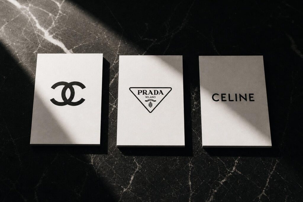
Style 1 — Luxury Minimalist: The Power of Restraint
Visual traits: Serif or clean sans-serif typography, monochrome palette (black, white, or a single neutral), wide letter-spacing, and absolutely zero decorative elements.
Brand examples: Chanel, Prada, Celine
The luxury minimalist approach operates on a principle that feels almost counterintuitive: the less you put in, the more premium the logo feels. Chanel's double-C monogram is the perfect case study. It's two letters. That's it. No gradient, no tagline, no decorative border. It works because it's perfectly symmetrical and needs no color to communicate its value — the restraint itself becomes the luxury signal. Prada and Celine operate on the same logic: if you have to shout, you're not luxury.
Best for: High-end boutiques, luxury clothing lines, premium accessories, and any brand whose positioning is "quality speaks for itself."
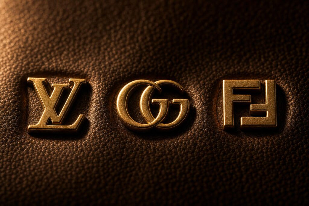
Style 2 — Monogram & Lettermark: Initial Impact
Visual traits: Interlocking or overlapping initials, strong geometric symmetry, a design that can be tiled or repeated as a pattern.
Brand examples: Louis Vuitton (LV), Gucci (GG), Fendi (FF)
What's fascinating about the monogram style is how it converts something as simple as initials into an entire visual universe. Louis Vuitton's LV monogram wasn't just designed to be a fashion brand logo — it was designed to be repeated as a surface pattern, which means the logo literally became the fabric. That's a level of brand integration most companies spend decades trying to achieve. The GG and FF patterns from Gucci and Fendi work on the same principle: the logo isn't applied to the product, it is the product.
Best for: Heritage fashion brands, personal designer labels where the founder's name is the brand, and bespoke tailoring services.
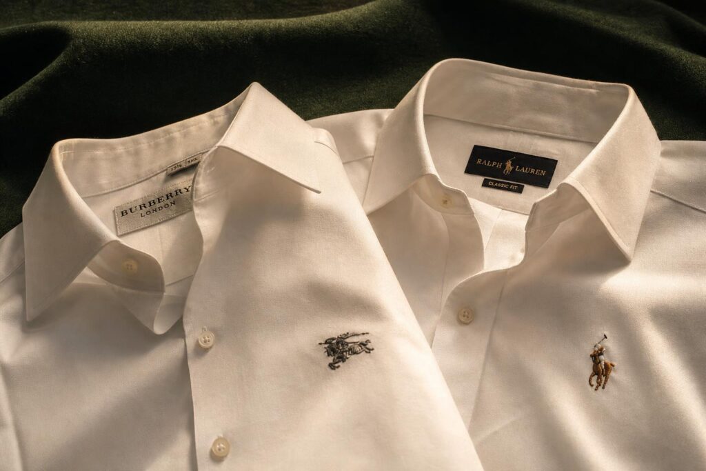
Style 3 — Classic Emblem & Crest: Heritage as a Design Asset
Visual traits: Badge or crest-shaped containers, detailed illustrations inside (horses, shields, crests, polo players), traditional serif typography, often in navy, green, burgundy, or gold.
Brand examples: Burberry, Ralph Lauren
The emblem style is the fashion brand logo equivalent of a firm handshake and a family crest. It signals heritage, craftsmanship, and a very specific social aspiration. Ralph Lauren's polo player is perhaps the most studied example: it's not just a logo — it's a lifestyle declaration. The tiny mounted polo player on a shirt collar tells you this brand believes in a certain kind of elegant, preppy, aspirational Americana. It tells you exactly who the brand thinks you are, or who you want to become. That's extraordinarily powerful communication for a two-inch embroidery.
Best for: Heritage fashion brands, British or European-style clothing, equestrian or preppy aesthetics, and any brand selling tradition alongside its product.
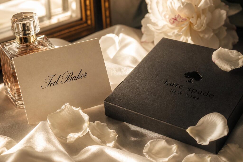
Style 4 — Feminine & Delicate: The Language of Softness
Visual traits: Script or handwritten-style fonts, soft line illustrations (flowers, botanicals, delicate geometric forms), pastel palettes or neutral tones like blush, ivory, and dusty rose.
Brand examples: Ted Baker, Kate Spade
Here's what most people get wrong about the feminine-delicate style: they think "soft" means "simple to execute." It doesn't. Ted Baker's script wordmark is a masterclass in controlled elegance — it looks like it was dashed off with a calligraphy pen, but it was almost certainly agonized over for months. It performs approachability and personality without sacrificing an ounce of sophistication. Kate Spade achieves something similar with its clean spade icon and crisp typography: it feels like a brand a clever, stylish woman designed for herself.
Best for: Women's boutiques, bridal and occasion wear, lifestyle brands, accessories, and any brand whose core customer values personality and warmth alongside quality.
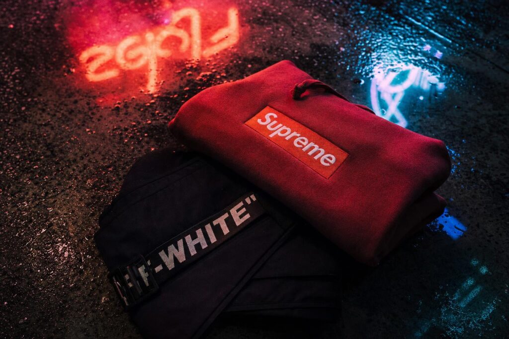
Style 5 — Streetwear & Bold Graphic: Attitude as Identity
Visual traits: Heavy block lettering, stark high-contrast color combinations (usually black on white, white on red, or neon on black), bold graphic symbols, and a deliberate rawness that rejects polish.
Brand examples: Supreme, Off-White
Supreme's red box logo might be the single most studied fashion brand logo of the 21st century, and here's the wild thing: there's almost nothing to it. Futura Bold font. White text. Red rectangle. That's the entire design. But Supreme understood something most designers miss — the logo was never meant to carry the brand alone. It was meant to be a vessel that the community fills with meaning. By keeping it deliberately simple, Supreme gave their audience something they could own, replicate, parody, and ultimately transform into a cultural symbol. The simplicity was the strategy, not the constraint.
Best for: Urban streetwear, youth and subculture fashion, sneaker brands, and any label where the community IS the brand.
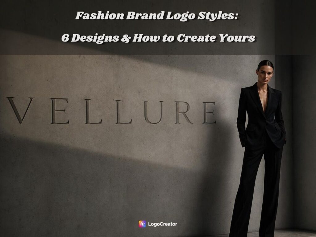
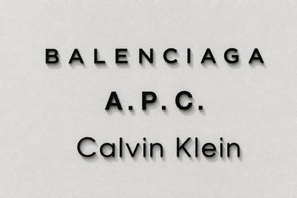
Style 6 — Modern Wordmark: Typography as the Entire Brand
Visual traits: A single clean sans-serif typeface, the brand name as the complete logo with no additional icons, and precise letter-spacing that does all the heavy lifting.
Brand examples: Balenciaga, A.P.C., Calvin Klein
The modern wordmark is the style most likely to divide opinion. "It's just a font" is a criticism you'll hear constantly — which is exactly why it works. Balenciaga's 2017 rebrand under Demna Gvasalia switched the fashion brand logo to a typeface nearly identical to the Paris Metro signage font. It was controversial. It looked "wrong." Design purists complained loudly. And then it became one of the most copied logo aesthetics in contemporary fashion brand logo. The point is that choosing a typeface is a design decision of enormous consequence, and when it's done with intention, "just a font" becomes an entire brand worldview.
Best for: Contemporary fashion startups, DTC clothing brands, gender-neutral labels, and any brand where the name itself is the core asset.
The Design Elements Behind Every Fashion Brand Logo
Now that you've seen the six styles, let's go one level deeper. Every fashion brand logo — regardless of style — is built from the same fundamental elements. Understanding how these elements work will help you make informed decisions rather than just going with whatever feels "nice."
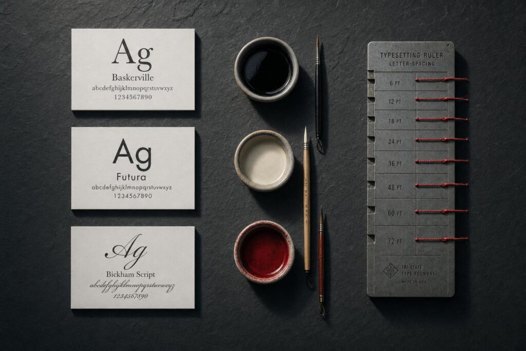
Typography — What Your Font Choice Says About Your Brand
Fashion logo fonts and colors are the two most misunderstood elements of brand design, so let's be direct. Typography is not decoration — it's communication.
- Serif fonts (think: Dior, Vogue, Burberry) carry centuries of cultural baggage that works in your favor: authority, heritage, permanence, luxury. If your brand is positioning itself as elevated and timeless, serif is your starting point.
- Sans-serif fonts (Calvin Klein, Balenciaga, Celine post-2018) signal modernity, clarity, and a certain confidence that needs no ornamentation. They're the font equivalent of a perfectly tailored white shirt.
- Script and handwritten fonts (Ted Baker, Cartier) introduce personality, warmth, and a human touch — they're particularly effective for brands built around the founder's personal aesthetic or feminine sensibility.
The decision rule is simple: pick the typeface that matches the emotional experience you want customers to have, not the one you personally find most attractive.
Color — The Silent Signal Your Palette Sends
Why do Chanel, Prada, Celine, and Bottega Veneta all predominantly use black and white? It's not because they lack imagination. It's a deliberate signal. In fashion brand logo, color scarcity equals sophistication. When a brand refuses to compete on color, it's communicating that its other qualities — construction, materials, design — are more than enough. Black and white also have the practical advantage of working everywhere without ever clashing with the product.
Neutral tones — warm beiges, ivories, dusty mauves — have become the signature of what's now called "quiet luxury": the understated, old-money aesthetic that rejects visible logos in favor of fabric and cut. Meanwhile, bold color choices in streetwear (Supreme's red, Palace's triangle in primary colors) aren't random either — they're cultural territory markers that signal belonging to a specific tribe.
The takeaway: choose your fashion brand logo colors the way you'd choose the neighborhood for a flagship store. It's a positioning decision, not an aesthetic one.
Symbols, Icons & the Rule of Letter-Spacing
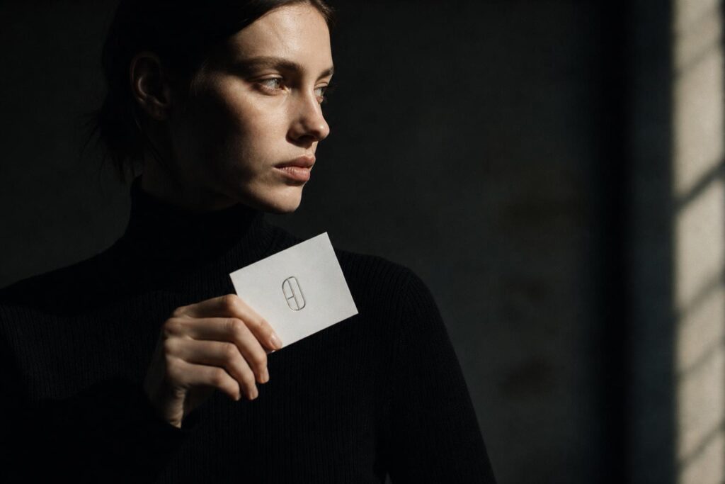
One of the most common mistakes new fashion brands make is rushing toward a symbol or icon before they've established any name recognition. Here's the practical rule: if someone could look at your icon and not know what brand it belongs to, you're not ready for a purely icon-based fashion brand logo. Nike spent years building name recognition before the swoosh could stand alone. Build name recognition first; let the icon earn its independence later.
And on the subject of letter-spacing — this is genuinely the most underrated design decision in fashion logo fonts and colors territory. Wide letter-spacing creates visual breathing room that the eye automatically associates with premium quality. It's why luxury brand wordmarks almost always feel "airy." Tight letter-spacing, by contrast, feels energetic, approachable, and casual — which is exactly what it signals for streetwear. Adjust your spacing intentionally, and you can shift the perceived price point of your brand without changing a single letter.
How to Create A Fashion Brand Logo Using Image to Logo AI
Theory is great. But at some point you have to actually make the thing. Here's a practical five-step process that works whether you're a complete beginner or a freelancer who just needs to prototype faster.

Step 1 — Define Your Brand Personality (3 Questions)
Don't touch a fashion brand logo design tool until you can answer these three questions clearly:
Who is your target customer? Not "women aged 25–45." Something more specific: "Women in their 30s who shop at Cos and follow Matilda Djerf, prioritize quiet over loud, and will pay more for something that lasts." The more specific, the more direction it gives your design choices.
What three words describe the brand personality of your fashion brand logo? Write them down. Then look at your current logo concept — does it visually communicate those words? If you picked "bold, urban, irreverent" but your logo looks like a spa, there's a disconnect.
What fashion brand logo styles are your competitors using? This isn't about copying them — it's about knowing what visual language already exists in your space, so you can decide whether to align with it or deliberately differentiate.
Step 2 — Collect Visual Inspiration
Build a reference board before you start creating anything. Save logos you admire, color palettes that feel right for your brand, fonts that match your tone, and any visual imagery that captures your brand's spirit. Pinterest, Instagram, even packaging from brands you love — all of it counts.
This reference board serves a second purpose: it becomes the input material for your AI logo tool. The clearer your visual direction, the better the output you'll get.
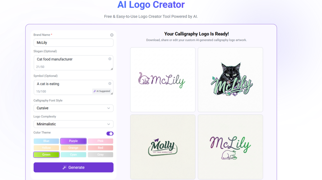
Step 3 — Use LogoCreator's Image to Logo Feature
This is where things get efficient. LogoCreator's image to logo tool lets you upload any reference image — a logo you admire, a mood board photo, a color palette screenshot, even a texture — and the AI analyzes the visual style, color relationships, and compositional logic to generate a custom fashion brand logo that captures the same energy.
The workflow: upload your reference image → select your preferred style direction → receive your generated logo. No briefing a designer. No waiting for revisions that may or may not land. No design software to learn. For startup founders, Etsy sellers, and content creators who need professional results on a timeline that matches the real world, this gap between inspiration and execution is exactly what makes the difference.
Steps 4 & 5 — Refine and Test Across Contexts
Once you have a generated logo, resist the urge to call it done immediately. Spend time adjusting the font weight, letter-spacing, color values, and proportions until it feels exactly right. Small changes here have disproportionate impact.
Then test it in context: resize it to 16x16px and see if it's still legible. Place it on your website header mock-up. Put it on a product label. Use it as a social media profile picture. Drop it onto a packaging concept. A great fashion brand logo should survive all of these without losing its identity. If it falls apart at small sizes or disappears on a colored background, that's useful information to feed back into your refinement process.
Famous Fashion Brand Logos — What They Teach Us About Design Decisions
Case studies are only useful when you extract transferable lessons rather than just admiring the outcome. Here's what each of these iconic fashion brand logos actually teaches us.
Chanel proves that symmetry plus restraint equals permanence. The double-C monogram has barely changed since 1925 because it was designed without any elements that could date it. The lesson: build for longevity by removing anything trend-dependent from day one.
Louis Vuitton teaches us that a logo can transcend its medium. By designing the LV monogram to function as a repeat pattern, the brand created something that could live on canvas, leather, silk, and stone — the logo became architecture. The lesson: think about where your logo will live, not just what it will look like.
Nike demonstrates that an icon can eventually outgrow language entirely. The swoosh no longer needs the word "Nike" next to it. But this took decades of consistent brand building and massive investment — the lesson here isn't "make an abstract icon," it's "be consistent enough, long enough, that your mark becomes self-explanatory."
Supreme is the most radical lesson of all: meaning is not inherent in design, it's assigned by culture. The red box logo is nothing until the community decides it's everything. The lesson: invest as much in your community and cultural presence as you do in your visual identity.
FAQ — Fashion Brand Logo Design Questions Answered
Q1: What makes a good fashion brand logo?
A great fashion brand logo is simple enough to be instantly recognizable, distinctive enough to be memorable, and aligned closely enough with the brand's personality that it works as shorthand for everything the brand stands for. It should also scale cleanly from a tiny favicon to a large-format print without losing legibility or impact.
Q2: Which logo style is best for a new fashion brand?
For most new fashion brands, a clean wordmark is the smartest starting point. Your name needs to build recognition before an abstract icon can carry meaning on its own. A well-executed modern wordmark or luxury minimalist typography gets you professional results while your brand equity grows — then you can introduce icon elements when the audience already knows who you are.
Q3: Can I turn an inspiration image into a fashion brand logo without design skills?
Yes, and this is genuinely one of the more useful recent developments in design tooling. LogoCreator's image to logo feature lets you upload any visual reference — a photo, a screenshot, a texture, even another logo you admire — and generates a custom logo that captures the same visual energy and style. It's particularly useful for founders and creators who have strong visual taste but no technical design background.
Q4: What fonts do luxury fashion brands use?
Most luxury fashion brands gravitate toward either classic serifs or refined geometric sans-serifs — rarely anything in between, and almost never anything decorative or novelty. Didot (used by Vogue and Giorgio Armani), Helvetica variants, and custom typefaces based on these proportions dominate. The consistent theme is restraint: the typeface should feel inevitable, not chosen.
Q5: How do I make my fashion brand logo look high-end?
Four immediate adjustments: reduce your color palette to two colors or fewer, increase your letter-spacing (more than feels comfortable), choose a clean serif or geometric sans-serif and commit to it, and ruthlessly remove every graphic element that isn't load-bearing. High-end doesn't mean complex — it means precise. Every element that survives should be there for a reason.
Conclusion — Your Fashion Brand Logo Starts with the Right Style
Choosing a fashion brand logo style isn't a creative exercise you get to approach casually. It's a strategic decision rooted in who your customer is, what emotional experience you want to create, and which visual language your brand genuinely speaks. The six styles we've covered — luxury minimalist, monogram and lettermark, classic emblem, feminine and delicate, streetwear bold, and modern wordmark — are not equally interchangeable options on a menu. Each one carries decades of cultural meaning, a distinct set of design rules, and a very specific audience expectation.
Now you have the framework. The next move is yours. Upload your inspiration image to LogoCreator, let the image to logo AI translate your visual direction into a real fashion brand logo, and see what your brand looks like when it finally speaks the right visual language.