
Anime Logo Design: 15 Cool Symbols, Styles & Motion
An anime logo can express a fictional world in one compact mark. A sharp silhouette might suggest a fast action story, while a rounded mascot, celestial crest, or energetic wordmark can signal comedy, fantasy, or adventure. The strongest designs feel dramatic without becoming difficult to recognize.
This guide explores 15 original ideas and a practical workflow for creating an anime logo without copying protected artwork. It also explains how to animate a logo so its symbol, lettering, and final frame work together.
The examples here are for design analysis and inspiration. LogoCreator is not affiliated with, endorsed by, or partnered with One Piece, Naruto, their creators, publishers, studios, or other rights holders mentioned in this article. Create original characters, symbols, lettering, and motion for your own project.
Table of Contents
- What Makes an Anime Logo Stand Out?
- 15 Cool Anime Logo Ideas and Symbols
- What the One Piece Logo and Naruto Logo Teach
- Japanese Logos, Anime Symbols, and Originality
- How to Create an Original Anime Logo With AI
- How to Animate an Existing Anime Logo
- Best Motion Styles for Anime Logos
- Anime Logo Design and Animation Checklist
- Bring Your Anime Logo to Life
What Makes an Anime Logo Stand Out?
An effective anime logo balances personality with instant recognition. A clear silhouette, one meaningful symbol, and controlled typography usually create a stronger identity than a crowded composition.
A recognizable silhouette
View the mark at thumbnail size. A good anime logo remains legible on a profile image, video corner, or merchandise tag. Large shapes should carry the idea before tiny details appear.
A symbol connected to the story
The best anime symbols feel native to a project. A moon can represent a night guild; a fractured ring can suggest a portal. Give the symbol a story role so the anime logo communicates without a character illustration.
Typography with a readable structure
Angled terminals can imply speed, brush textures can add energy, and wide geometric letters can suit science fiction. An anime logo still needs readable spacing and a clear hierarchy between the name and subtitle.
Color that supports the genre
Choose a small palette before adding effects. Dark violet and cyan can feel futuristic; coral and mint can suit a friendly mascot. A restrained palette makes an anime logo easier to reproduce and animate.
15 Cool Anime Logo Ideas and Symbols
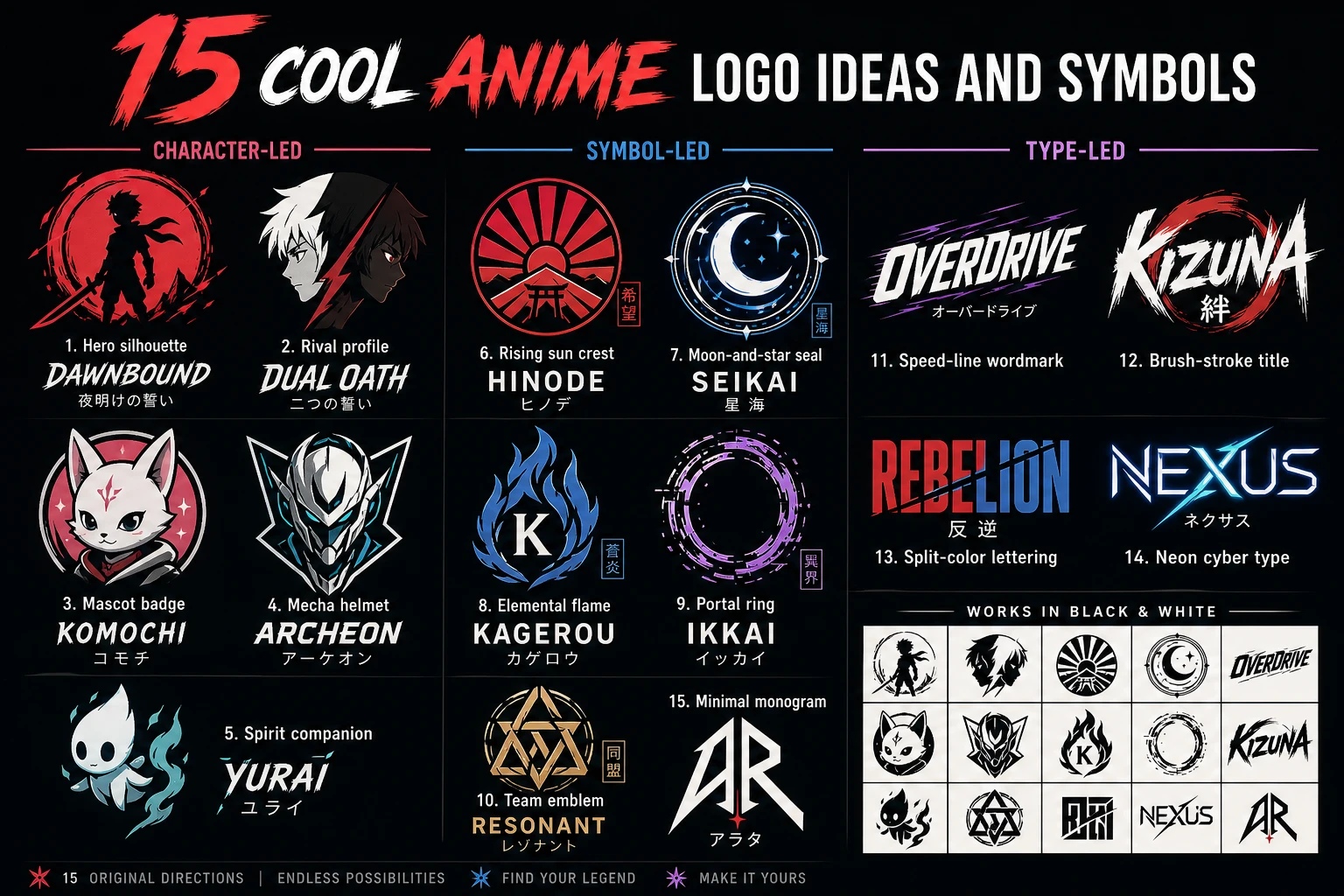
The matrix groups 15 original directions into character-led, symbol-led, and type-led concepts. Adapt each anime logo idea to your own series, creator channel, game community, or brand.
| Character-led direction | Symbol-led direction | Type-led direction |
|---|---|---|
| 1. Hero silhouette: a distinct pose framed by one bold shape | 6. Rising sun crest: layered rays built from custom geometry | 11. Speed-line wordmark: angled letters with controlled forward motion |
| 2. Rival profile: two opposing profiles divided by negative space | 7. Moon-and-star seal: a celestial badge with a unique orbit pattern | 12. Brush-stroke title: readable lettering with selective dry edges |
| 3. Mascot badge: an original creature reduced to a friendly emblem | 8. Elemental flame: one stylized flame enclosing a small initial | 13. Split-color lettering: a simple wordmark divided by story factions |
| 4. Mecha helmet: an invented visor and armor silhouette, not a known robot | 9. Portal ring: broken arcs suggesting travel between fictional worlds | 14. Neon cyber type: geometric letters with one luminous accent line |
| 5. Spirit companion: a tiny original guide paired with a compact name | 10. Team emblem: interlocking shapes representing a crew or guild | 15. Minimal monogram: two initials shaped into an original anime symbol |
Pick one central idea, then decide what viewers should notice first. A mascot anime logo might use a circular badge and rounded type; a rival-themed mark might rely on negative space and two contrasting colors.
Cool anime logos feel rich because their concept is specific, not because every surface is decorated. Test the design in black and white. If the symbol reads, the anime logo has a solid foundation; add only one genre cue without sacrificing clarity.
What the One Piece Logo and Naruto Logo Teach
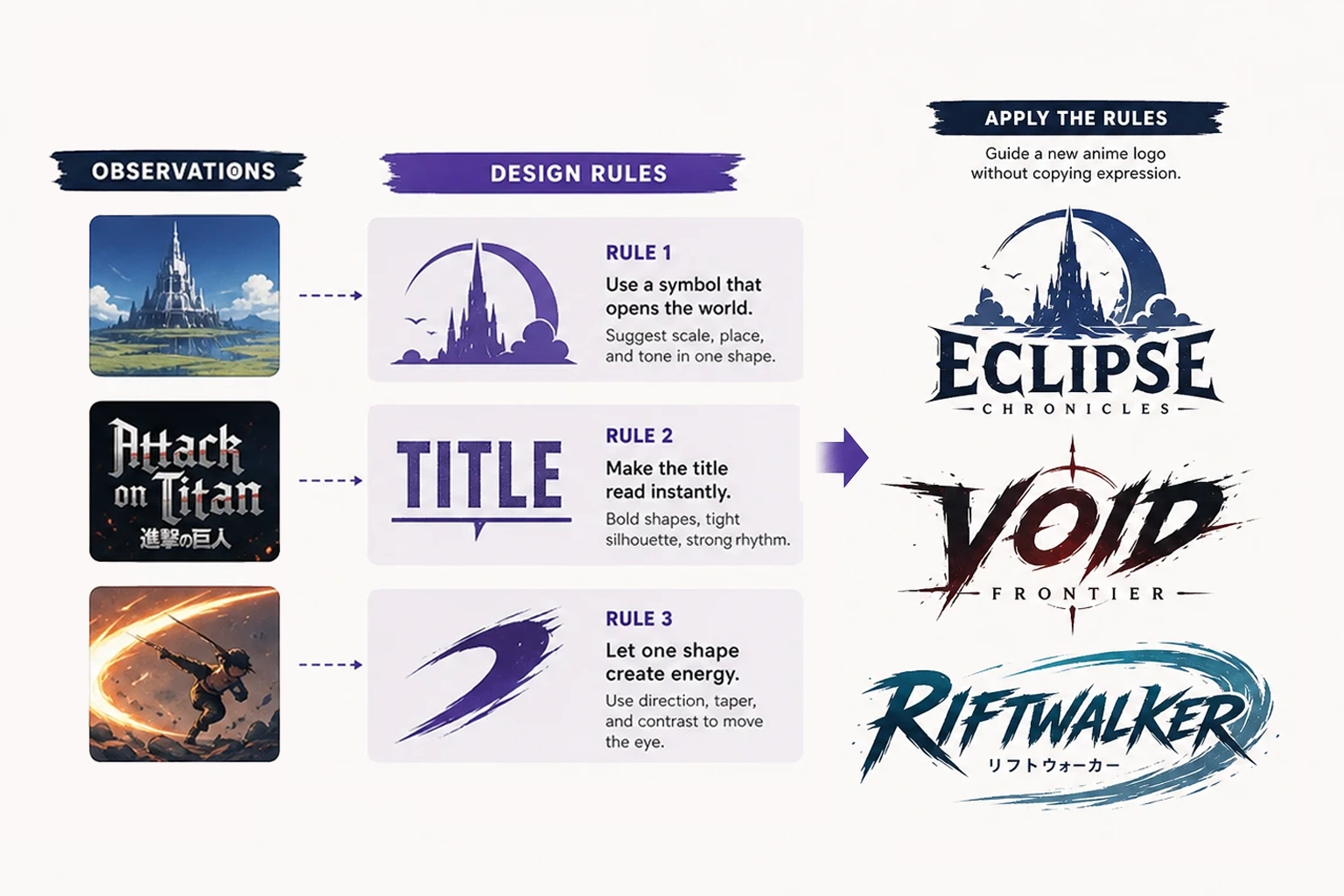
Popular title marks are valuable references because they show how visual identity can introduce a story. The goal is not to recreate the One Piece logo or Naruto logo, but to study why a title mark can remain memorable across posters, episodes, products, and fan conversations.
The One Piece logo: make the world visible
The One Piece logo shows how a title can introduce an adventure through story-specific imagery and a memorable overall shape. The lesson for an original anime logo is to choose a symbol that belongs to its world. A fictional sky-courier project might use a custom wing or route emblem without borrowing a protected pirate symbol, character, or title treatment.
Give your anime logo a dominant outline and clear reading order, especially when the title appears over busy artwork.
The Naruto logo: typography can carry movement
The Naruto logo shows that energetic lettering and sweeping shapes can make type behave like an image. An original anime logo can suggest momentum with a rising baseline or tapered stroke while retaining its own letterforms.
Do not trace a familiar title font or repeat its visual combination. Name the intended emotion—speed, optimism, or mystery—and build a new typographic system around it.
Convert references into design rules
Turn observations into principles: the symbol introduces the world, the title reads at a distance, and one shape creates energy. These rules can guide a new anime logo without carrying over protected visual expression.
Already have an original static design? Use animate your existing anime logo to explore motion while keeping the creative focus on your own symbol and wordmark.
Japanese Logos, Anime Symbols, and Originality
Japanese logos include corporate marks, traditional crests, character identities, and technical symbols. Do not treat “Japanese” as one visual filter; research the relevant cultural and genre context instead.
For an original anime logo, start with your narrative. List the setting, conflict, recurring object, tone, and audience, then translate one idea into geometry. A mountain academy might use an invented peak-and-book crest; a cosmic music club could combine a note with a custom orbit.
Anime symbols become memorable when they are simple enough to redraw and specific enough to own a role in the story. Build them from basic shapes, test their negative space, and remove details that disappear at small sizes. Do not reuse clan crests, pirate emblems, village marks, character silhouettes, or other identifiers associated with an existing work.
Originality also applies to typography. Design or license suitable lettering and keep the name readable. If you use Japanese characters, confirm language accuracy with a qualified speaker. An anime logo should communicate intentionally, not introduce an incorrect phrase.
How to Create an Original Anime Logo With AI
AI can help convert a written concept into visual directions, but a useful prompt needs more than “make an anime logo.” Define the subject, shape, tone, typography, palette, and production constraints before generating. This keeps the exploration aligned with your fictional world.
1. Write a one-sentence identity brief
State who the design is for and what it should signal. For example: “Create an anime logo for Moonrail, an original sci-fi courier guild that feels fast, optimistic, and precise.” A focused brief prevents unrelated characters and decorative effects from taking over.
2. Choose one distinctive symbol
Connect the symbol to the story rather than a famous series. For Moonrail, that might be a crescent intersected by two parallel route lines. Describe its geometry and exclude unnecessary imagery. A single memorable symbol gives the anime logo a clearer thumbnail and makes later motion easier to plan.
3. Define typography and color
Specify readable custom-style lettering, the relationship between symbol and name, and a limited palette. You might request a wide geometric wordmark, white and deep navy as base colors, and one electric-cyan accent. Ask for a flat presentation without mockups so you can judge the actual anime logo rather than the scene around it.
4. Generate directions, then edit
Use AI Logo Creator to explore an original concept from your brief. Compare variations by silhouette, readability, symbol relevance, and simplicity. Treat generation as a starting point: refine awkward letterforms, spacing, color values, and small shapes before adopting the design as an identity.
5. Test practical versions
Check the anime logo on light and dark backgrounds, in one color, and at small scale. Separate the icon from the wordmark if the project needs a profile avatar. A practical identity should work without glow, texture, or a character illustration, even if those elements appear in promotional art.
An anime logo maker can accelerate visual exploration, but the creative decision remains yours. Review the result for unwanted resemblance to existing works and seek appropriate professional advice when legal clearance matters.
How to Animate an Existing Anime Logo
Animation should reveal the idea already present in the design. Before opening an animation tool, identify the hero element: the symbol, the title, or the relationship between them. A short reveal with a clean final frame usually serves an anime logo better than constant movement.
1. Prepare the static design
Export a clean version with adequate resolution and clear edges. Remove background clutter and check that the title is readable. If the static anime logo depends on tiny textures, simplify them before animation so compression and motion do not turn them into noise.
2. Upload the existing logo
Open the AI logo animation generator and upload your completed design. This workflow is for giving motion to an existing anime logo; it does not replace the concept, symbol, or lettering decisions made during design.
3. Choose or describe one motion concept
Select a suitable motion direction or describe how the mark should appear. Match the action to the visual logic: a portal ring can rotate into place, route lines can draw forward, or a mascot badge can settle with a restrained bounce. A coherent logo with animation feels designed, while unrelated flashes and spins feel added afterward.
4. Use AI Enhance when helpful
AI Enhance can help develop the motion instruction when the initial description is too broad. Keep the intended sequence easy to verify: opening state, main reveal, and stable end frame. For an anime logo, the enhancement should support the identity rather than invent a different mark.
5. Generate, review, and download
Generate the animation and inspect the symbol, lettering, colors, timing, and final frame. If any element becomes distorted or difficult to read, revise the motion choice or prompt and generate again. Once the result meets your needs, download the MP4 and test it in the real placement where viewers will encounter it.
Best Motion Styles for Anime Logos
The right movement depends on structure and tone. These approaches can work for anime logos when they reinforce the static design instead of covering it.
Line-draw reveal
A line-draw reveal suits emblems, monograms, and brush-inspired lettering. Let the most important contour appear first, then resolve the remaining shapes quickly. This approach makes the construction of an anime logo understandable and gives the viewer a natural focal point.
Light sweep
A narrow light sweep can emphasize a blade edge, visor, star, or geometric wordmark. Keep the highlight brief and preserve the original palette. A broad, repeated glare can reduce readability, while one controlled pass adds polish to an animated logo.
Particle assembly
Particles can support magic, energy, space, or transformation themes. Give them a clear destination so they assemble the symbol instead of drifting without purpose. The final anime logo should hold long enough to be recognized after the effect ends.
Scale, snap, or soft bounce
A small scale-up or bounce works well for a mascot, comedy project, or friendly community identity. Use restrained overshoot and settle quickly. Excessive elastic motion can make even cool anime logos feel generic or distract from the title.
Orbit or directional arc
An orbit works when the static mark already includes a ring, moon, route, or circular frame. Animate that existing relationship, then stop at a precise final position. This creates a purposeful anime logo reveal with fewer effects.
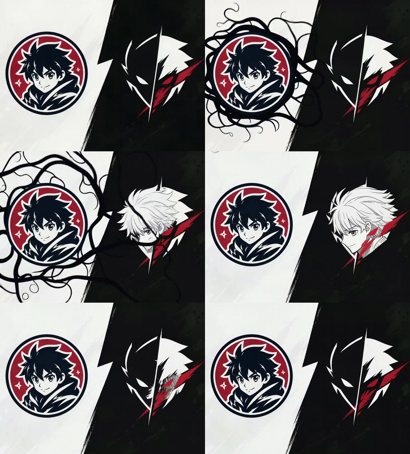
Whatever style you choose, ask three questions: Does the motion express the project? Can the name still be read? Does the last frame match the approved static mark? These checks matter more than the number of effects in the animation.
Anime Logo Design and Animation Checklist
Use this checklist before approving an anime logo or publishing its animated version:
- Original concept: The symbol, character, lettering, and composition come from your own project rather than an existing franchise.
- Clear silhouette: The anime logo remains recognizable at thumbnail size and in one color.
- Readable name: Decorative strokes do not obscure essential letterforms or spacing.
- Focused palette: A small color system supports the intended genre and works on light and dark backgrounds.
- Meaningful symbol: The emblem relates to the story, team, channel, or brand instead of serving as random decoration.
- Flexible layout: Icon-only, wordmark, and combined versions can cover common placements.
- One motion idea: The animation follows a single clear concept rather than stacking unrelated effects.
- Stable ending: The animated logo resolves to a clean frame and holds long enough to recognize.
- Visual consistency: Motion preserves the intended proportions, colors, and reading order of the static design.
- Real-context test: The final MP4 is reviewed at its intended size and placement before publishing.
If several items fail, return to the static design first. Animation amplifies both strengths and weaknesses; it cannot rescue an anime logo whose symbol or typography is unclear.
Bring Your Anime Logo to Life
A memorable anime logo starts with an original story, a recognizable silhouette, and a focused visual system. Famous title marks can teach useful principles about symbolism, typography, and movement, but your final design should express its own fictional world and remain distinct from protected franchise assets.
Once the static mark works at small sizes and in simple color, add motion that reveals its strongest idea. Keep the sequence short, protect readability, and finish on a stable brand frame. When your original anime logo is ready, bring your logo to life with AI animation, review the generated result carefully, and download the MP4 that best fits your project.